
Blog
Explore. Create. Be inspired. Join me on a journey through art & imagination. Let’s make magic!
Flow state in painting: why I keep going back to the physical canvas
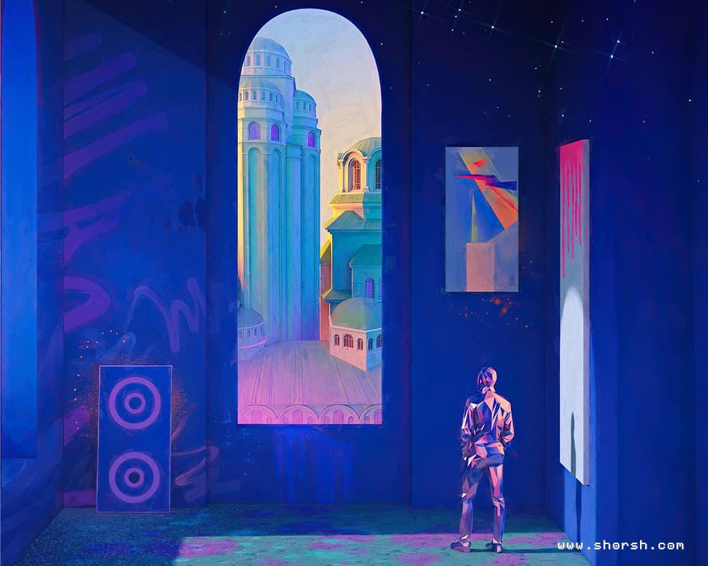
Flow state in painting is not something I set out to find. It shows up on its own, usually after I’ve been at the canvas long enough to stop thinking about anything except the specific problem in front of me. Most of my work is digital, but I keep returning to traditional painting precisely because it’s the place where that disappearance happens most reliably. It’s also where most of my ideas are born. What actually disappears when I hit flow state in painting When I’m deep into a painting, the sense of being a person with a schedule and a phone and a list of things to answer just falls away. It’s not that I forget my name. It’s that the part of my mind usually narrating my own experience goes quiet, and what’s left is just the problem: this color against that one, this edge too sharp, this shadow not dark enough yet. There’s a real pleasure in that quiet that I don’t quite get from anything else in my practice. Why digital work doesn’t quite get me there Digital tools are incredible for what they do, and most of my professional output depends on them. But undo is always one keystroke away, and that changes something fundamental about how you engage with a mark. There’s also the fact that a screen is never just a canvas: it’s also email, a notification, a browser tab you could open in half a second. You can turn all of that off, but the temptation is still built into the device itself, sitting right there under the surface. Painting doesn’t have that problem. There’s no undo, and there’s no ping. Everything moves slower too, at the pace of pigment drying and glazes settling, which is nothing like the speed the rest of the industry runs at. And there’s something more basic underneath all of that: with traditional materials, you actually get your hands dirty. The paint, the texture, the resistance of the brush against canvas, all of it passes through your body in a way that touching a cold screen and a plastic stylus never quite manages. Digital work happens through your fingertips on glass. Painting happens through your whole hand, and somehow that difference matters more than it should. Almost a whole year spent on one problem This year, in 2026, I took a painting workshop entirely dedicated to the color wheel: every pigment tendency, every mixing relationship, tested directly in new pieces rather than just studied on a chart. Spending months on a single technical question like that is a kind of focus my digital workflow rarely allows for, since client deadlines don’t usually leave room for a year of pure investigation into one variable. Why the flow state in painting isn’t therapy, but works like one I don’t think of this as therapy, and I’d be careful about calling it that. What I do think is true is that the practice of painting, specifically its slowness and its refusal to let you undo anything, absorbs you completely in solving its own problems. Making you forget everything else for a while isn’t a side effect, it’s close to the whole point. If there’s something curative in that, it isn’t coming from the finished piece. It’s coming from the hours spent inside the problem itself. I keep going back to the canvas because that flow state in painting is hard to manufacture on purpose, and painting is still the most reliable door into it that I’ve found.
Read more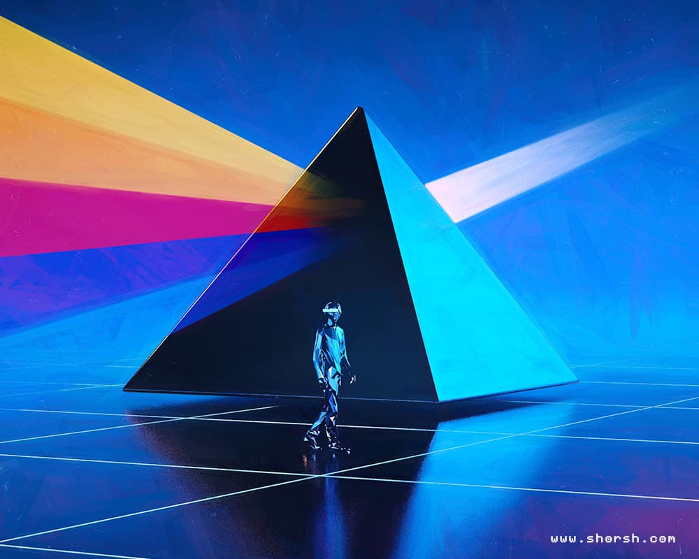
Find your artistic voice: a practice, not a discovery
I’ve been re-reading Find Your Artistic Voice : The Essential Guide to Working Your Creative Magic by Lisa Congdon, a book I’ve recommended before . It pushed me to think about what actually changed my own work over the years, as opposed to what just sounded good in theory. Below are some key takeaways. To find your artistic voice, treat it as a practice, not a discovery Nobody finds their artistic voice in a single moment of clarity. It shows up gradually, through the accumulation of thousands of small decisions made across hundreds of pieces. Every sketch, every finished commission, every abandoned draft adds one more data point to a pattern you can only see in hindsight, never while you’re inside it. That means patience isn’t optional. Often, the version of your work you make this year won’t look like the version you make in five years, and comparing the two too early just gets in the way. Influence isn’t the enemy Early in my career, I copied compositions from illustrators I admired almost exactly, just to understand how they built an image. That phase wasn’t a detour from developing my own voice. It was the training that made one possible later. The shift happens when you stop copying a single influence and start filtering several through your own decisions at once. A color sensibility from one artist, a compositional habit from another, a subject matter you keep returning to on your own: none of it stays recognizable as someone else’s once it passes through enough of your own choices. Voice isn’t the absence of influence. It’s what’s left after you’ve metabolized enough of it that no single source is visible anymore. Constraints help more than freedom does An empty canvas and infinite options is one of the worst starting points for finding a distinct voice. Instead, I work better with a specific limitation: a two-color palette, a fixed composition rule, a self-imposed deadline. The constraint isn’t a creative sacrifice. It’s what forces a decision instead of an infinite hesitation between equally valid options. The mistakes that helped me find my artistic voice In fact, most of what I know about my own work came from pieces that didn’t turn out the way I wanted, not from the ones that did. A failed color combination taught me more about my own palette instincts than any successful piece did, because the failure forced me to articulate exactly what was wrong, which is a more precise kind of learning than “that worked.” Finding your artistic voice isn’t a destination you arrive at and then stop working toward. It’s closer to a moving target that gets a little clearer every time you show up and make something, whether or not that something turns out well.
Read more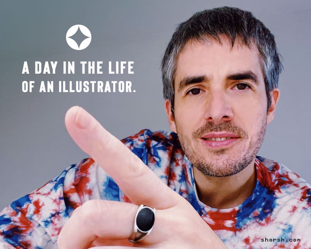
A day in the life of an illustrator: my real routine
This is what a day in the life of an illustrator looks like from my studio. The scent of freshly brewed coffee, no sugar, fills the air as I settle in around 8 or 9 am. Once I have it, I’m ready. But before anything else, I grab my dog and we head to the park for a morning walk. Sunshine, fresh air, and a good audiobook. That’s how a day in the life of an illustrator starts for me: not at the desk, but outside, letting ideas arrive before I sit down to work on them. Getting organized: tools for a working illustrator’s day Once the walk is over, it’s all systems go! I rely heavily on Notion to keep my schedule organized (shoutout to their free version!). It’s my digital command center, holding project templates, notes, and a clear roadmap for the day. Meanwhile, the bulk of my day is dedicated to illustration projects. Occasionally, design requests pop up, keeping things interesting. I sprinkle in short breaks throughout the day, not just to rest but because coming back to the piece with fresh eyes each time makes it easier to catch whether it’s still matching what I had in mind. A quick stretch, a lunch break, and later on, another tiny cup of coffee before getting back to work. How I approach a new project When starting something new, I almost always begin with a mood board. I collect images from Pinterest, books, my own camera, anything that captures the visual territory I’m trying to reach. Then I compile everything in Photoshop, organized by layers, and start sketching over it to pull out a color palette . From there, depending on the project, I work in 2D or move into a clay render in 3D. For the 2D side, I’ve put together a roundup of free resources for illustrators worth bookmarking, pose reference, brush packs, color tools. I illuminate and texture that render with high quality materials, then often paint over the final version to add detail and push the piece further. I also keep a collection of free 3D textures on the site for materials. Plenty of projects still call for custom-built assets or premium libraries I pay for myself. Free resources don’t set the price of the work, they’re just one part of a much bigger process. And if the mood board process interests you, there’s a full walkthrough on how to build one . The second half of the day Around 6 or 7 pm I try to wrap up client work and leave room for personal projects. That might mean working on an illustration of my own, doing some freehand painting, or just switching off with a book, sci-fi film or some music. Video games are also a consistent source of visual input for me. I spend more time on Steam browsing promotional art , key art, and concept work than actually playing. The level of craft that goes into game visuals, the world-building, the character design, the way studios use color and lighting to build atmosphere, is genuinely worth studying. It’s a different corner of the illustration industry, and keeping an eye on it stops my own references from narrowing. What a day in the life of an illustrator is really about Music, paintings, books, films, games, all of it feeds the work, just not in a straight line. The structure of the day matters, but so does leaving room for the things that aren’t work and still end up shaping it anyway. That’s what it comes down to for me. Not just the hours at the desk, but staying curious enough that when I sit down to work, there’s something real behind it.
Read more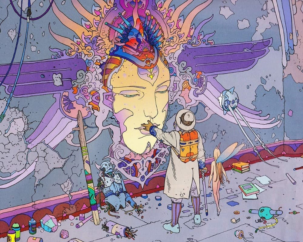
Four sci-fi graphic novel illustrators I still enjoy
These are the sci-fi graphic novel illustrators I keep going back to. Not because any of them taught me a specific lesson. More because the work still holds up every time I look again. Moebius, Charles Burns, Frank Frazetta, and Fiona Staples. Four very different reasons to open a comic and just look for a while. Here’s why each of these sci-fi graphic novel illustrators still gets my attention. Moebius (Jean GirauMoebius, the sci-fi graphic novel illustrator I return to most) Moebius, the pseudonym of Jean Giraud, is the sci-fi graphic novel illustrator I go back to most. The Incal, made with Alejandro Jodorowsky, is the work most people mention first, and it still holds up. It’s also decades old at this point. What I actually reach for more, though, is Edena. Somewhere along the way he deliberately simplified his line into something closer to clear line work, almost no hatching. That restraint is what gets me every time, proof that detail isn’t what makes a page interesting after all. Charles Burns and unease in black and white Charles Burns works in stark black and white. Black Hole is still the best example of what that can do. It’s about a strange plague warping teenage life. The horror comes from how ordinary most of it looks, even now. His line work is precise almost to the point of being uncomfortable, which is exactly the effect. This is the artist I think of first when a scene needs to feel unsettling rather than just dark. Frank Frazetta and motion in fantasy illustration Frank Frazetta painted muscle, motion, and weather better than almost anyone in fantasy illustration. Conan the Barbarian and A Princess of Mars are the covers everyone remembers, and they hold up decades later. What gets me about his work is the composition. The way a figure sits in a scene so the whole thing reads as motion instead of a pose. The color is honestly what gets me most. His palettes shouldn’t work on paper, deep oranges against muddy greens, hot pink skies over a battlefield. Somehow every one of them does. I stare at those color choices longer than I do at the figures half the time. Fiona StFiona Staples and the sci-fi graphic novel art of Saga Fiona Staples draws Saga. Her characters carry more expression in a single panel than most artists manage in a page. The way her art fits Brian K. Vaughan’s writing is close to seamless, neither one overshadows the other. That balance is the thing I notice most. Especially when a piece has both image and text competing for attention. Her color choices are just as deliberate, bold where the story needs a jolt, quiet where it doesn’t. Four sci-fi graphic novel illustrators, four different reasons to keep the books on the shelf. I still go back to all four regularly, for different reasons each time. If you want to see where this shows up in practice, my piece on Salvador Dalí touches similar ground.
Read more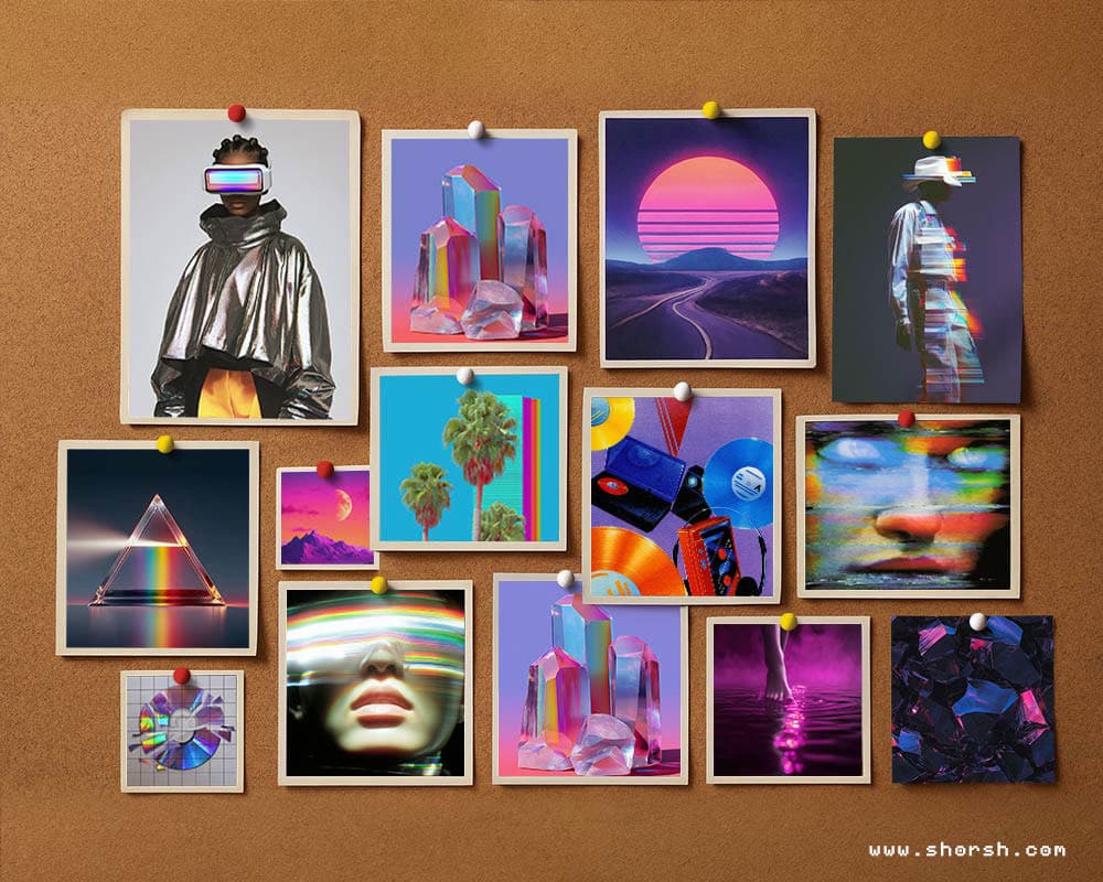
How to make a moodboard before you start a project
This is how to make a mood board that shapes a project instead of just decorating a folder. A moodboard is a collage of images, colors, textures, and text. Together they pin down the mood or direction of a project before anything else starts. Designers use them for fashion, interiors, graphic work, film, basically anywhere. Anywhere a visual direction needs to exist before the real work begins. What a moodboard actually is It’s a reference point, not a finished piece, something to keep the whole project pointed in one direction. Without one, a project can drift. Colors shift halfway through, references stop matching, and nobody quite agrees on the tone anymore. A single moodboard, made before anything else, solves most of that in advance. It’s the cheapest insurance a project has, which is really the whole case for learning how to make a moodboard. How to make a moodboard: start with keywords, not images Before collecting a single image, write down what the project needs to feel like. Three or four words are usually enough: warm, rustic, weathered, quiet, whatever actually describes the thing. Those words become the filter for everything that comes next. If an image doesn’t match at least one of them, it doesn’t belong on the board. Collect images from more than one place Pinterest, Behance, and Instagram cover most of it. But they also flatten everything into the same algorithmic look after a while. Magazines and books break that pattern, and scanning or photographing a page still counts as a legitimate source. I keep color palette references in the same folder as photos and textures, no separate system. Nothing here needs to be original, drifting off into unrelated references for a while usually turns up something useful anyway. How to make a moodboard stick: put it together and step back Once you’ve collected the images, arrange the strongest ones first, near the center, and build outward from there. Canva, Adobe Spark, and Milanote all work for a digital board. A corkboard or a sketchbook page works just as well for a physical one. Group similar images together, then step back. Check whether the whole thing still reads as one idea instead of a pile of references. That’s most of how to make a moodboard, three parts: words, images, arrangement, in that order. Once it’s set, the colors and textures you picked usually end up shaping the actual piece more than you’d expect. That same instinct for color carries over into painting itself. That’s where flow state actually shows up for me . STEP 3. Organize and Assemble Your Mood Board. Last, with a collection of images at hand, the final step is to organize and assemble your mood board. This step involves arranging your visuals in a way that clearly communicates the mood and direction of your project. How to Organize and Assemble Your Mood Board: Choose a Format: Decide whether you want to create a physical or digital mood board. For digital mood boards, tools like Canva, Adobe Spark, and Milanote offer user-friendly interfaces for assembling your images. For physical mood boards, you can use a large poster board, corkboard, or even a sketchbook. Arrange Your Images: Start by placing your most important images in the center or at focal points on your board. Arrange the remaining images around them, paying attention to composition and balance. Group similar images together to create a cohesive look. Refine Your Board: Once your images are arranged, take a step back and review your mood board. Make any necessary adjustments to ensure that the overall composition is visually appealing and effectively conveys your intended mood. Add any final touches, such as notes or keywords, to enhance clarity. In simple lines: creating a mood board is a valuable exercise for any creative project. It helps you visualize your ideas, refine your aesthetic direction, and communicate your vision clearly. By following these three simple steps, defining keywords and subjects, finding and collecting images, and organizing and assembling your mood board, you can craft a mood board that serves as a powerful tool in your creative process. Once your mood board is defined, you can further refine your investigation by paying attention to the colors, formats, and textures that you want to include in your project. Happy creating! Discover how painting can get you into a flow state that digital work never quite reaches, at least for me 😉
Read more
How I reduce screen time as an artist
Why I stopped trying to use less screen overall and started giving my phone, my iPad, my desktop, and my analog desk completely separate jobs instead. My phone, my iPad, and my desktop don’t do the same job, and that’s the actual system. The phone is where every dopamine-driven distraction lives, so I treat it as the one space to actively guard against. That’s how I reduce screen time as an artist without turning it into a chore. The iPad works as a mobile desk instead: no social apps, no feeds, nothing built to steal attention. That’s where I spend the most time, running Procreate and Nomad Sculpt alongside a few audio tools. I work out ideas there on the move. The desktop is also a Mac, but it runs through a large monitor. That’s where I actually sit down to produce and finish pieces. I keep distractions away from that desk, the phone especially, though it has to sit nearby sometimes for work. That’s when an extreme iOS focus profile with no distracting notifications does the real work. Splitting devices, not reducing screen time However, advice to reduce screen time as an artist never worked for me as a general rule. The real problem was never the screen, it was interruption. Social feeds, or any passive scroll, put you in what I think of as consumption mode. That mode is sneaky: it feels like you’re doing something, when really you’re making nothing at all. The gap between feeling busy and actually producing is the frustrating part. Production mode is the only way out. That’s the actual reason I reduce screen time as an artist. I read enough about creativity to notice a pattern. In fact, disconnecting and working with your hands is genuinely productive, not just relaxing. For instance, wasting a little time on purpose helps too. Analog and digital work also move at different speeds, and feel different too. Indeed, with your hands you’re touching the material; with a screen, you’re touching an interface between you and it. So that changes how you relate to the work, not just how fast you make it. The iPad as a second, parallel work hub The iPad runs its own small set of tools, separate from the computer entirely. Procreate handles sketching, 2D illustration, and sometimes painting directly onto the 3D models from Nomad Sculpt. Nomad Sculpt is where the actual 3D modeling happens, not Procreate. Beyond that, Koala Sampler, GarageBand, and a few synths and drum machines round out the sound side. Also, the sound tools exist because motion graphics projects sometimes need original loops or chimes. Not stock audio. For example, my last project with Klydoclock, a new collection of animated watchfaces, used sounds I built myself. Chimes included, all on that same iPad. The desktop, where pieces actually get finished The desktop is also a Mac, but a completely different setup from the iPad. Photoshop , Cinema 4D , Blender , and After Effects live here, plus Logic for anything music-production related. This is where sketches and 3D blocks from the iPad turn into finished pieces. The monitor is large enough to actually see detail, something the iPad screen can’t match. I keep the phone away from this desk on purpose. Sometimes work forces it to sit nearby anyway, and that’s when the extreme focus profile earns its keep. An analog desk the phone never reaches My analog desk has watercolor paper, a cabinet with inks, pencils, watercolor, gouache, and acrylics. Next to it is a small reference library: art books by John Harris, artist monographs from Taschen. Besides those, a few are on color theory, others built around traditional-media exercises. I’ll sometimes bring the iPad to that table for digital reference. The phone stays somewhere else entirely. No cheap dopamine at the drawing table. If you’re curious how the hands-on side of this works day to day, I’ve written about it elsewhere. Two posts worth starting with: protecting that time and a few small rituals that keep it going. Sketchbook habits fill a similar role for me, on the days I never open the iPad at all. What changes once I actually reduce screen time Once nothing external can interrupt, something in the attention itself shifts. Eventually, you stop noticing time passing, and the work absorbs whatever you’d normally spend on checking a phone. A lot of my bigger projects started on paper this way. They only got bigger once I brought technology into them. Other times I go straight to the machine. But I still reach for materials when I want a real problem, not a simulated one. There’s no undo button on watercolor paper. Solving those problems by hand turns out to be more fun, not less. It’s also more satisfying, since the work stays physical from start to finish. Holding a finished piece you made with your own hands hits differently than opening a finished file. After all, that’s part of why I reduce screen time as an artist in the first place. As a digital artist, escaping screens completely isn’t realistic, and I’ve stopped pretending otherwise. Instead, what changes is the focus, not the number of hours in front of a screen. That’s the version of this I can actually keep.
Read more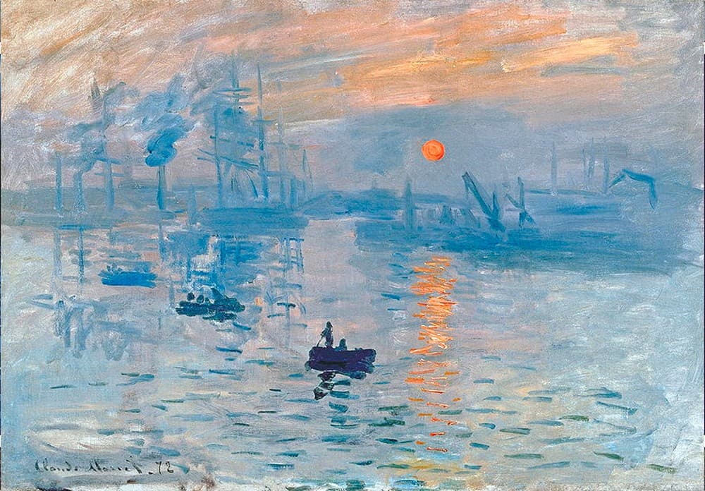
Landscape illustration styles: five ways to build a mood
Landscape illustration styles cover an enormous range, from paintings that read almost like photographs to compositions reduced to two or three shapes and a horizon line. Understanding that range matters whether you’re building a visual vocabulary for your own work or trying to figure out which references actually serve a specific project. These are the five styles I come back to most often, with the artists and works that define each one most clearly. Realistic and romantic landscape Realism in landscape illustration doesn’t just mean accuracy. It means using light, atmosphere, and detail to make a place feel inhabited and felt, not merely documented. Caspar David Friedrich is the clearest example: his figures standing before vast landscapes aren’t describing nature, they’re measuring the human scale against it. The emotional weight comes from that contrast. J.M.W. Turner pushed realism toward something closer to pure atmosphere. His late paintings dissolve landscape into light and weather to the point where the subject almost disappears. What survives is the feeling of a place rather than its topography. That approach, sacrificing legibility for mood, is one of the most direct influences on how contemporary digital artists handle environmental lighting. Impressionist landscape illustration styles Impressionism broke the contract between painting and documentation. Instead of recording what a landscape looks like, impressionist painters recorded what it feels like to perceive it. The shimmer of light on water, the blur of trees in wind, color that shifts depending on the hour. Monet’s series paintings, the haystacks, the Rouen Cathedral, the water lilies, are studies in how the same subject changes completely under different conditions. For illustrators, impressionism is useful as a lesson in economy. The paintings work because of what’s left out. A few confident marks in the right place carry more visual information than a fully rendered surface, and that principle transfers directly to digital work. Abstract landscape illustration Abstract landscape illustration keeps the spatial logic of a landscape, a ground plane, a horizon, a sense of depth, while releasing any obligation to represent recognizable forms. Mark Rothko’s color field paintings are the extreme end of this: pure fields of color that produce an almost physical sensation of atmosphere and scale. What makes abstraction useful as a reference for commercial work isn’t the absence of representation but the clarity of composition. Abstract landscapes force you to solve the problem of space and mood without the shortcut of recognizable objects. Working from that constraint occasionally produces solutions that carry over into more representational work. Stylized and graphic landscape This is the landscape illustration style I find myself returning to most in my own work. Eyvind Earle , who created the visual language of Sleeping Beauty for Disney in 1959, developed a style that flattened natural forms into precise geometric shapes while keeping the color and mood of a real landscape. It feels both designed and alive. The stylized approach is particularly well-suited to work that needs to carry strong visual identity: album covers, editorial illustration, key art for entertainment. The graphic simplification makes the image readable at any scale, and the deliberate choice of a visual language gives the work a signature that purely realistic illustration often doesn’t have. Minimalist landscape illustration Minimalism in landscape illustration reduces the image to its essential elements: a horizon, a color field, sometimes a single form. Contemporary illustrators working in this direction often owe as much to graphic design as to painting. The challenge is that minimalism has no place to hide. Every decision is visible, and a weak composition can’t be rescued by detail. When it works, minimalist landscape illustration produces images with immediate visual impact and a quietness that other landscape illustration styles can’t replicate. It’s also the style that ages best, because it isn’t built on the visual conventions of any particular moment.
Read more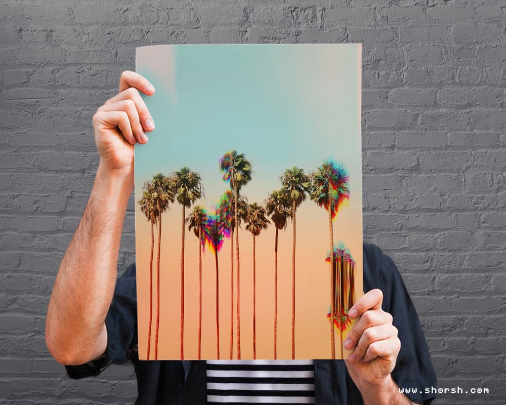
How to print digital art: from file to finished piece
Learning how to print digital art is mostly about what you do before you hit export, not the printer itself. I learned that the hard way. My first prints looked perfect on screen and came out muddy on paper. One poster came back with half an inch cropped off one side. This guide covers what I wish someone had told me first. Picking a process, prepping the file, and finding a printer you can trust. Why printing digital art feels different from a file A digital file only exists on a screen until you print it. The moment you hold a physical copy, something shifts. Paper has weight, texture under your fingers, a size you can stand next to. It also holds still. A screen looks different depending on the light in the room; a print always looks the same. Pick a method for printing digital art Giclée printing uses archival inks on heavier paper. I reach for it when a piece needs to hold its color for decades. Gallery work, fine art editions, anything meant to last. Digital printing is faster and cheaper, better suited to posters, postcards, or a run of merchandise. Turnaround time matters more than perfect longevity here. Screen printing is its own animal: bold, textured, a little unpredictable in a good way. I’d choose it for a small batch of something meant to feel handmade rather than precise. Match the method to what the piece is actually for. A one-off gift and a hundred-unit print run call for different processes, even if the artwork is identical. Get the file ready before you print anything Set your resolution to at least 300 dpi. Anything lower and the print looks soft, especially in fine linework or small text. Switch your color profile to CMYK before you finalize anything. RGB looks brighter on screen than it ever will on paper, and that gap catches almost everyone the first time. Add bleed, extra image past the edge of your file. That way a shifted trim line doesn’t cut into anything important. I add at least 3mm on every side now. It’s a habit since I lost part of a signature to a bad trim early on. Ask for a proof before committing to a full run. A physical or digital proof is the only reliable way to see how your colors actually translated. Catching a problem there costs a few dollars instead of an entire print run. Choose paper for how it will feel, not just how it looks Heavier stock feels more substantial the moment someone picks it up, and it holds up better over time. Smooth paper keeps fine linework crisp. Textured paper adds a tactile quality that suits looser, painterly pieces. Matte finish feels quieter and more traditional; glossy adds punch and works well for anything bright or graphic. If you’re planning to frame and display the print, these five ideas for decorating with art are worth a look. That’s useful once you’ve got paper and finish sorted. Find a print shop that treats your file like it matters Look for a print studio with actual samples, not just a price list. Ask what they’ll do if the proof doesn’t match, and pay attention to how they answer. A shop used to working with artists will walk you through resolution and bleed without you needing to ask. One that isn’t might just print whatever you upload and hope for the best. What happens once you print your digital art The first time you hold your own print, it changes how you think about the piece. It’s no longer just a file in a folder; it’s an object someone can hang, gift, or buy. Try more than one paper and finish before you settle on a favorite. Frame a piece for your own wall, or offer a small limited run and see how people respond. What’s the best way to prepare digital art for print? Set your file to 300 dpi, switch to CMYK, and expect your colors to shift, especially in saturated digital hues. Soft-proofing in Photoshop or your illustration software gives you a preview before you commit. Add a bleed area of about 3mm. If the run matters, print one sample copy first so you catch surprises before the full run. Can I start selling prints as a beginner? Yes. Start small: a handful of pieces you’re proud of, photographed in real settings rather than flat on a scanner. That way buyers can see the scale and texture. Early buyers are also your best source of honest feedback on paper choice and packaging. Etsy and Printify are common starting points, along with local shops or pop-up events if you’d rather sell in person. Every time you print digital art, you learn something the file alone couldn’t show you. If you want to see where mine end up, my full collection is in the Shop . Can I start selling my art prints as a beginner? Yes. Start small: a handful of pieces you’re proud of, photographed in real settings rather than flat on a scanner. That way buyers can see the scale and texture. Early buyers are also your best source of honest feedback on paper choice and packaging. Etsy and Printify are common starting points, along with local shops or pop-up events if you’d rather sell in person. Every time you print digital art, you learn something the file alone couldn’t show you. If you want to see where mine end up, my full collection is in the Shop .
Read more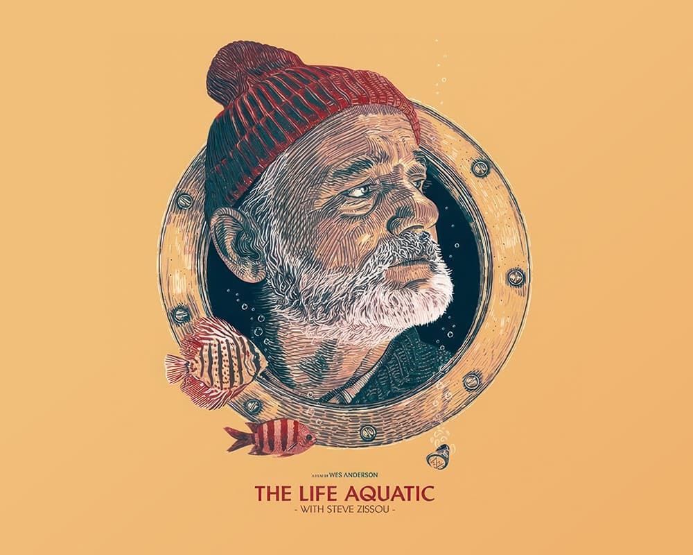
Free movie reference sites for artists: posters, stills, and animation
These are the free movie reference sites for artists I actually use, split across posters, live-action stills, and animation. Some overlap a little, but each one does something the others don’t. Posters split into curated versus comprehensive, stills split the same way, and animation gets its own separate lane. Six sites, six different jobs. None of them cost anything to browse. TMDB for movie and TV data, plus posters It started as a database, cast, crew, ratings, release info, and the posters came along with it. It’s community-driven, so coverage is broad across movies and TV shows both. I go here first when I need context on a film before I go looking for specific images elsewhere. The posters are useful, but the database itself is the real reason I keep coming back. IMP Awards, a free reference site for theatrical posters It sticks to one thing: official theatrical posters, movies only, no TV. It’s been running for years, and the curation shows: consistent quality, high resolution, easy to browse by year. When I need one strong poster reference fast, this is where I go before anywhere else. Fewer options than a full archive, but every one of them is solid. As far as free movie reference sites for artists go, this one is the most consistent for posters specifically. MoviePosterDB for movie and series posters at scale It covers a lot more ground than IMP Awards, movies and TV series both, millions of scans. You can search by director, country, or decade, which helps when you’re chasing something specific. Quality varies since it’s community-uploaded, but the sheer range covers gaps IMP Awards doesn’t. I use this one when a project involves a TV show, since IMP Awards won’t have it. It’s one of the free movie reference sites for artists I reach for occasionally, but it fills a real gap. Filmgrab for curated cinematography stills It’s hand-picked, not automated, over 160,000 stills chosen for composition and color. That curation is the whole point: every frame here is worth looking at twice. I pull palette references from here more than anything else, framing a close second. It’s slower to browse than a raw archive, but every result earns its place. Movie-Screencaps.com, a free reference site for live-action stills It takes the opposite approach from Filmgrab: comprehensive instead of curated. Full galleries per film, wide genre and era coverage, high resolution throughout. When Filmgrab hasn’t covered a specific film, this is usually where I find it instead. Less curated means more digging, but also more raw material to work with. Worth bookmarking alongside Filmgrab, not instead of it. Animation Screencaps, the free reference site for animated film None of the other five sites cover animation, which is where this one fills a real gap. Frame-by-frame captures from Disney, Pixar, DreamWorks, and plenty of older studios besides. For character acting, staging, and color in animated work specifically, nothing else on this list comes close. This is the one I send other illustrators to first when animation comes up. Between all six, posters, live-action stills, and animation frames are covered from more than one angle each. That’s the real value of keeping more than one free movie reference site for artists bookmarked at once. A poster from IMP Awards can end up decorating a space just as easily as it ends up as reference. Every Single Frame works differently It isolates individual frames from a curated list of films, organized by director and shown in random order, so you look at each one as pure composition rather than as part of a story. The directors it covers, from Kubrick to Miyazaki to Villeneuve, are chosen for strong visual control, which makes it a solid stop specifically for studying framing and color rather than hunting a particular scene.
Read more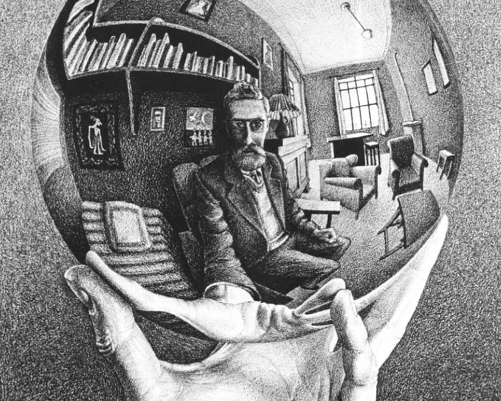
MC Escher paintings: the logic behind the impossible
MC Escher paintings look like optical tricks at first glance, but the trick is never the point. Escher trained as a graphic artist, not a mathematician, and what makes his work last is that he builds every impossible structure with the same rigor as a real one. The geometry is wrong, but it’s wrong in a way that’s internally consistent, which is exactly what makes it so hard to look away from. I’ve been drawn to MC Escher’s paintings since my first years as a student, and it’s stayed influential in how I think about composition ever since. Sky and Water I: an MC Escher painting where the illusion lives in the gaps In “Sky and Water I” (1938), birds at the top of the composition gradually become fish at the bottom, using the same tessellated shape the entire way through. Nothing about any single bird or fish is impossible. The trick is in the transition: your eye can’t decide at what exact point a bird stopped being a bird, so it experiences the whole print as a continuous transformation rather than two separate images. That’s the actual mechanism behind most of Escher’s tessellation work, ambiguity placed exactly where your visual system expects a clean boundary. Drawing Hands: a loop with no starting point “Drawing Hands” (1948) shows two hands, each drawing the other into existence on the same sheet of paper. There’s no way to determine which hand came first, because the image doesn’t give you an entry point outside the loop. That’s the real subject of the piece: not the technical skill of the rendering, which is considerable, but the fact that the logic of cause and effect simply has nowhere to attach. Relativity: how this MC Escher painting builds three gravities “Relativity” (1953) works by giving each staircase and doorway a locally consistent gravity, then connecting them into a single structure where those gravities contradict each other. A figure walking normally on one staircase is walking sideways relative to a figure on the staircase next to it. Escher never breaks the internal logic of any individual path. He only breaks the assumption that all paths in a building share the same downward direction. Ascending and Descending: the staircase that goes nowhere “Ascending and Descending” (1960) uses the Penrose stairs as its foundation, a loop of four staircases that each appear to climb, while together forming a closed rectangle that never actually gains height. Figures walk the loop endlessly, always ascending, never arriving anywhere. The illusion depends entirely on being viewed from one fixed angle. Move the camera and the impossible structure falls apart instantly, which is exactly what makes the flat, static nature of a print the ideal medium for it. Waterfall: causality folded into a single object In “Waterfall” (1961), water falls, turns a wheel, then travels back uphill through a series of aqueducts to fall again. Escher hides the impossibility inside a structure that looks like ordinary architecture: columns, beams, a stone channel. The perpetual motion isn’t the interesting part. What’s interesting is how plausible each individual segment of the structure looks in isolation. What actually holds up in MC Escher’s paintings None of these prints rely on trickery in the way a magic trick does. They rely on exploiting a gap between local logic and global consistency, and doing it with enough craft that the gap isn’t visible until you go looking for it. That combination, mathematical rigor plus genuine, unforced imagination , is why MC Escher paintings still get studied by architects, game designers, and illustrators who have nothing to do with fine art.
Read more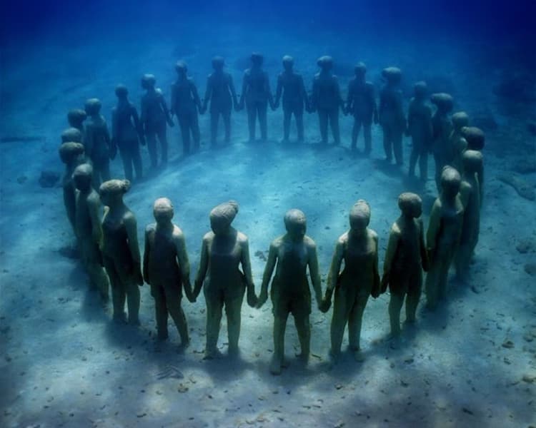
Environmental art installations that turn landscape into the artwork
Environmental art installations solve a problem most studio work never has to face. The material is the landscape itself, and the artist doesn’t fully control it. In fact, six environmental art installations here make that clear, from a desert spiral in Utah to a sculpture park growing coral on the sea floor. Each one works with tide, wind, light, or time instead of against it. Spiral Jetty: an environmental art installation that changes with the water Robert Smithson built Spiral Jetty in 1970. He moved over six thousand tons of basalt rock and earth into the Great Salt Lake, Utah . He coiled it into a spiral nearly 1,500 feet long. Depending on the water level, the piece disappears under the lake for years at a time, then resurfaces coated in salt crystals. Smithson designed the work to change, so the artwork is really the process of submersion and reappearance, not a fixed object. Still, that’s a strange kind of authorship for an illustrator to sit with. I finish a piece and it stays finished. Spiral Jetty was never meant to. Sun Tunnels: aligning stone with the solstice Nancy Holt built Sun Tunnels in 1976, roughly eighty miles from Spiral Jetty in the same Utah desert. Four massive concrete cylinders, each eighteen feet long, sit in the desert. The rising and setting sun aligns through their centers on the summer and winter solstices. Holes drilled into the walls, in patterns matching four constellations, let light through during the day. Each tunnel doubles as a rough calendar and a naked-eye observatory. Basically, it’s a piece built around events that happen twice a year. Meanwhile, most of the time you’re just standing in a desert looking at concrete tubes. You’re waiting for the sky to catch up with the design. Ephemeral sculpture on the Isle of Skye On Scotland’s Isle of Skye , artist Martin Hill and photographer Philippa Jones build sculptures out of stone, branches, and leaves near the Fairy Pools. Instead of lasting, the work erodes or washes away within days. Photographing the piece becomes part of the work itself, since the sculpture won’t outlast the season. Still, there’s something honest about building art you know won’t survive contact with the place it’s made from. The Lightning Field: an environmental art installation built for storms Walter De Maria installed The Lightning Field in the high desert of New Mexico in 1977. It’s four hundred stainless steel poles, arranged in a precise grid spanning a mile by a kilometer. Each one is polished to a point. On a clear day the poles catch the light and mostly disappear. During a storm, though, they draw lightning strikes. Visitors who want to see the piece have to book an overnight stay nearby and wait. Instead, De Maria left the actual event of the work up to whatever the sky decides to do that week. An underwater sculpture park off the coast of Grenada J ason deCaires Taylor’s underwater sculpture park sits submerged off the coast of Grenada, one more entry in this run of environmental art installations built to change on purpose. Taylor never intended the park to stay as it looked on installation day. Eventually, coral colonizes the concrete figures, and fish move in. The sculptures slowly disappear under the very marine life they exist to shelter. It’s an odd goal for a sculptor: build something so it eventually looks nothing like what you made. Antony Gormley’s Inside Australia, Lake Ballard In the Australian Outback, Antony Gormley cast fifty-one humanoid figures from the bodies of local residents. He scattered them across the dry bed of Lake Ballard . Even so, seen from a distance, the figures look almost lost in the scale of the landscape around them. Each one is small against several kilometers of empty salt flat. Gormley built the piece around that imbalance on purpose, setting a human figure next to a landscape too big to fully take in. What connects these six environmental art installations isn’t a shared aesthetic, since they don’t look anything alike. Instead, each artist gave up some amount of control over the final image and let weather, tide, coral, or the solstice finish the work. That’s the part I keep thinking about back in the studio, where I control every layer until I decide otherwise.
Read more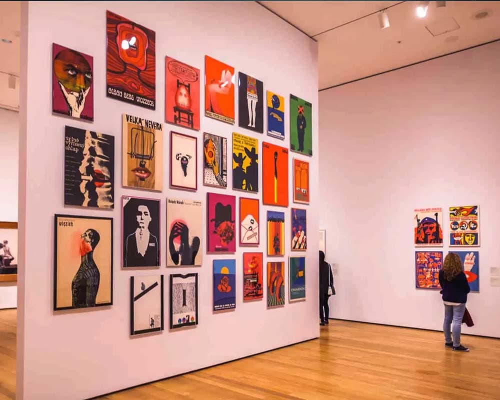
Online art collections worth your time: seven places to start
Online art collections used to mean a handful of low-resolution jpegs and a clunky interface. That’s changed. I actually use several of these as reference tools now, not just for browsing on a slow afternoon. Google Arts & Culture: the widest net Google Arts & Culture partners with over 2,000 museums and cultural institutions worldwide. That makes it the best starting point if you don’t know exactly what you’re looking for. The image resolution is high enough to study brushwork and texture up close. That matters if you’re pulling reference for your own composition work, not just looking. The Louvre and the Guggenheim, without the line The Louvre offers online tours that get you into rooms that are usually packed with tourists, letting you actually look at a piece instead of fighting for a sightline. The Guggenheim does something similar for its rotating exhibitions, which is useful since those shows close and disappear from view otherwise. British Museum, MoMA, Smithsonian, and Rijksmuseum Beyond the two above, the British Museum , MoMA , the Smithsonian , and the Rijksmuseum all maintain searchable online collections. Each has its own focus. MoMA covers modern and contemporary work. The British Museum spans a much longer historical range. The Rijksmuseum focuses specifically on Dutch masters. Why this actually matters for working artists Having this much visual reference available for free changes how research works. Instead of relying on secondary sources or low-quality reproductions, you can go to high-resolution scans of the actual pieces. That’s a meaningfully different experience when you’re trying to understand how a specific artist handled color transitions or edge control. A small printed reproduction loses exactly those details. These collections are worth building into an actual research habit rather than saving for one-off browsing sessions.
Read more
How to look at art: a method for seeing more
Most of us never learned how to look at art. We walk through a gallery, stop in front of something, feel something or feel nothing, and move on. That’s a valid way to spend an afternoon. But if you’ve ever stood in front of a painting and wondered what you’re supposed to be seeing, there’s a more deliberate approach worth trying. This is the method I come back to when I want to see a piece clearly, whether I’m visiting an exhibition or studying a reference for my own work. Slow down before you do anything else The first step has nothing to do with art history or technique. It’s just time. Give the piece at least two full minutes before you form an opinion. That sounds simple, but in practice most people spend under thirty seconds in front of any given work before moving on. Stand still. Let your eyes move across the surface without trying to name what you’re seeing. Notice where your gaze keeps returning. That involuntary pull is usually the most honest signal you have. Look at the formal elements first Before asking what a painting means, look at what it’s made of. Where is the light coming from? How has the artist used color, and is the palette warm or cold? What’s in the foreground and what’s been pushed to the back? Is there a clear focal point, or does the composition keep your eye moving? These aren’t academic questions. They’re the same questions I ask when I’m building a composition myself. Understanding how a piece is constructed often explains why it feels the way it does. What to look for beyond the obvious This is the question that changed how I look at art. Every painting is also a set of decisions about what to leave out. What’s cropped at the edge of the frame? Which parts are in shadow? What’s implied but not rendered? The negative space, the incomplete gesture, the figure that faces away: these choices are often where the real meaning is. Let your reaction be data, not a verdict Once you’ve looked at the formal structure, pay attention to what you actually feel. Not what you think you should feel. Unease is as interesting as beauty. A painting that makes you want to look away is telling you just as much as one that holds you there. If something specific is driving the feeling, try to identify what it is. A color relationship, a scale decision, the way two figures are positioned relative to each other. The more specific you can get, the more you’ll carry out of any exhibition. How to look at art that resists easy meaning You don’t need to arrive at an interpretation. Some of the most interesting works don’t offer easy ones. Giorgio de Chirico painted scenes that feel familiar and deeply wrong at the same time. Hilma af Klint made paintings that still don’t fit neatly into any existing category. Not quite understanding something is not a failure of observation. It’s often a sign that the work has real depth. Learning how to look at art isn’t about finding the correct answer. It’s a way of staying present long enough to let the work actually land. Cultivating a more mindful approach to art appreciation enriches your life and deepen your connection to the world around you.
Read more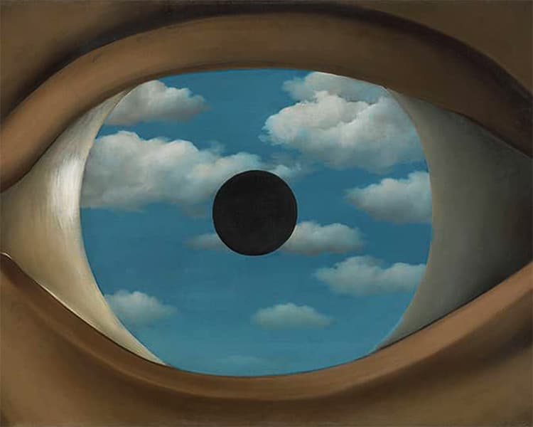
René Magritte surrealism: when the ordinary goes wrong
René Magritte surrealism occupies a category of its own. Born in 1898 in Lessines , Belgium, René Magritte spent most of his adult life in Brussels working in near-total obscurity before becoming one of the most recognizable painters of the twentieth century. Still, that trajectory matters. The domesticity of his life, the suburb, the suit, the bourgeois interior, wasn’t ironic background. It was the subject. I first came across his work as a child and didn’t have the vocabulary to explain why it bothered me. Something was wrong in the pictures but I couldn’t locate where. That quality, the feeling of a scene that looks completely normal until it doesn’t, is what René Magritte surrealism is actually about. Not dreams: what makes René Magritte surrealism different Generally, most people group Magritte with Dalí and assume surrealism means melting clocks and subconscious imagery. Magritte’s version is colder and, I’d argue, more disturbing. He wasn’t painting dreams. Instead, he was painting the ordinary world with one element displaced just enough to make everything else feel unstable. “The Son of Man” is a suited man in a bowler hat standing in front of a low wall, with the sea behind him. A green apple floats in front of his face. The painting is perfectly composed, lit like a Sunday afternoon. The wrongness is surgical. It doesn’t feel like a dream. It feels like a mistake you can’t find. “Memory of a Voyage” , from 1955, takes a different approach to the same problem. A pear and an apple, rendered in stone, stand together on a beach under a cloudy sky. The forms are perfectly familiar: the silhouette, the stem, the proportions are all correct. What’s wrong is the material. They’re the size of boulders and the texture of granite, and yet they’re unmistakably fruit. Magritte keeps the shape intact and changes only what they’re made of, which turns out to be enough to make the whole image feel displaced. The ordinary survives. The ordinary is exactly what’s unsettling. This is not a pipe “The Treachery of Images” , painted in 1929, shows a pipe rendered with the precision of a technical illustration. Below it, in careful cursive: “Ceci n’est pas une pipe”. This is not a pipe. The point isn’t wordplay. Rather, Magritte was making a precise argument: the image of a thing is not the thing itself. You can’t fill that painted pipe with tobacco. The representation and the reality are different objects, and we confuse them constantly. When I first understood what he was actually doing with that canvas, it reoriented how I think about images. A picture is always a translation, not a window, and working as an art director makes that distinction matter every single day. Golconda and the serial uncanny “Golconda” , from 1953, shows a sky filled with men in bowler hats and overcoats, falling or floating, suspended over a city of identical apartment buildings. There are enough of them to suggest a pattern, not enough to suggest an explanation. Even so, what Magritte understood about repetition is that it doesn’t make things more familiar: it makes them stranger. One suited man is a character. In fact, dozens of identical suited men filling the sky is something else entirely. The painting uses the visual logic of a crowd to produce the effect of a hallucination, and it does it without anything technically surreal happening. The men are just there. “The Mysteries of the Horizon” , also from 1955, takes the same logic further. Three men in bowler hats stand facing away from us, and behind each one hangs a different moon, each full, each at a different position in the sky. The scene is twilight-quiet. Three moons for three men, and no one seems to find that remarkable. What makes it unsettling isn’t the impossibility itself, it’s the indifference to it. Magritte keeps returning to that particular quality: the world behaving wrongly, with no one in the painting registering it as wrong. Why René Magritte surrealism still holds up Magritte’s paintings hold up because the questions they ask haven’t been answered. What is the relationship between an image and what it depicts? When does the familiar start to feel like a threat? Those questions are, in fact, more pressing now than they were in 1929. Nevertheless, we live inside images in a way Magritte couldn’t have anticipated, and his work remains one of the clearest demonstrations of why that’s worth paying attention to. “The Banquet,” from 1958, is the most outwardly peaceful image in his catalog: a row of trees at dusk, a terrace wall, a warm red sky. No floating figures, no impossible scale. Then you notice the sun. It sits in front of the trees, not behind them. A solid red disc hovering between the trunks and the viewer, obeying no physics that apply anywhere else. Magritte doesn’t announce it. The scene is completely calm. The wrongness is just there, waiting for you to find it. The unease in René Magritte surrealism doesn’t have an expiration date. Work built on ideas lasts longer than work built on style, and Magritte knew exactly which one he was making.
Read more
Free 3D textures and materials worth bookmarking
I keep a short list of free 3D textures and materials I go back from time to time for my renders. IMHO paying for a full library isn’t worth it unless a project actually needs something specific. These five sites cover most of what I need: HDRIs, PBR material sets, and the odd AI-generated texture. It comes in handy when nothing else fits. None of them require a subscription to be useful. Poly Haven for free 3D textures and HDRIs That’s where I start most of the time. It has textures, 3D assets, and HDRIs, all free, with a paid tier only for people who want even more. The free library alone is large enough to cover most everyday render needs, from weathered wood to studio lighting setups. That’s usually enough to build a scene without touching a paid asset. Poliigon for metalness-ready textures Poliigon also runs on a premium subscription, but the free tier holds a genuinely large selection of high-quality textures. One thing worth knowing before you download: pick the metalness workflow, not specular. It saves you a step when you bring the files into Redshift, Octane, Arnold, or Cycles. I skipped this step once and spent twenty minutes wondering why my metal looked flat. C4D Center for models and textures C4D Center leans more toward Cinema 4D users specifically. Beyond textures, it has a decent spread of free models too. That makes it worth a look even if texturing isn’t your main problem that day. It’s a smaller library than the others here, but the models fill a gap the texture sites don’t. I go there mostly for the models, not the textures. AmbientCG for free 3D materials at scale Among free 3D textures and materials sites, AmbientCG is the one I reach for when I need volume. Over 22,000 free assets, HDRIs, materials, and Substance 3D files included, all built for realistic renders. If Poly Haven doesn’t have what I need, this is usually where I find it. The library skews toward architectural and industrial surfaces, concrete, metal panels, worn wood, more than organic textures. Polycam for one-off AI-generated textures Polycam works differently from the rest. It generates simple textures from a text prompt instead of pulling from a library. That’s handy for the odd, specific texture nothing else has. The free tier caps out at 1024px, fine for smaller details, not for a hero surface filling the frame. I’ve used it maybe three times, but each one solved a problem nothing else could. Why bother with free 3D textures and materials at all The honest answer is time. Hand-painting a texture for every surface in a scene isn’t a good use of an afternoon. Not when a library already has something close enough to start from. I’d rather spend that time on composition and lighting. Or on the parts of a piece that actually need my hand. That’s the real case for free 3D textures and materials over hand-painting everything from scratch. Mixing textures from different sources works fine too: weathered wood from one site, a metal panel from another. Nothing has to match perfectly at the source since you’re adjusting values in your render engine anyway. Once a render is finished, printing it properly is its own set of decisions, but that’s a different guide. Bookmark whichever of these free 3D textures and materials sites matches your workflow. You’ll rarely need to paint a texture from scratch again. None of these are meant to be the final piece, though. I usually blend two or three together, warp them, repaint sections by hand. The goal is always a result that doesn’t look like it came from a library at all.
Read more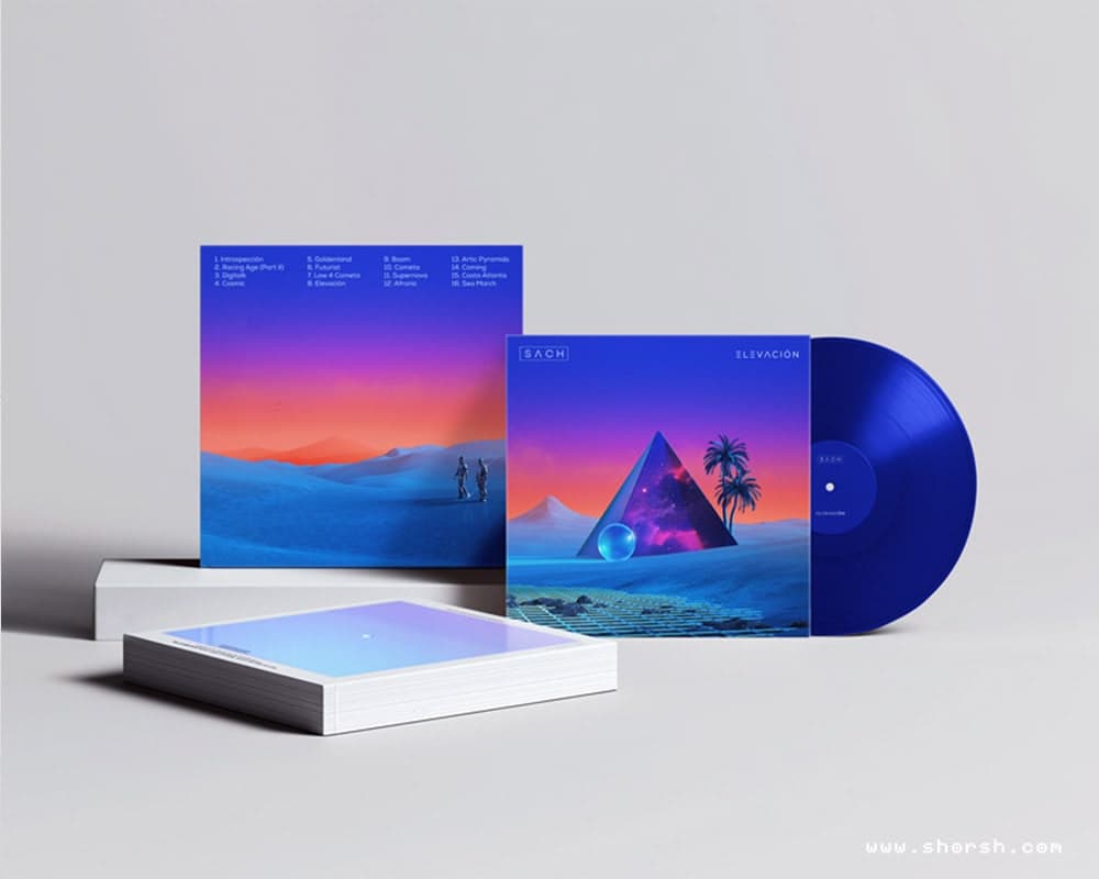
Album cover illustration: how I turn music into visual art
Album cover illustration always starts the same way for me: I put the music on and I don’t touch anything else for a while. I listen on repeat, sometimes for hours, letting the melodies, the lyrics, and whatever mood is underneath all of it settle before I pick up a pencil. The image has to come from the sound, not from a brief. My starting point has always been pencil or pen on paper. There’s something about capturing ideas as they come, without the friction of a screen between the thought and the mark. The final artwork is always fully digital, but those analog sketches are where the real decisions happen. How my album cover illustration process has changed My workflow has evolved considerably over the years. With tighter timelines and new tools appearing constantly, I’ve moved toward a more hybrid approach. Lately that means blending AI-generated fragments with my own sketches and photographs. The AI outputs are never final pieces. They’re starting points that I reshape and pull through my own visual language until they stop looking like anyone else’s work. From there I move into Cinema 4D or Blender, Photoshop, and sometimes After Effects, especially when the project involves animation, to build out the concept. I’m always watching how image-making technologies evolve, because the tools that best support the work tend to change faster than most people expect. That said, I’m not chasing every new release. I stick with the ones that actually serve what I’m trying to make, and add something new only when it genuinely changes what’s possible. The Forester project: building a visual identity from scratch One of the most memorable album cover illustration projects in my career was with the electronic music duo Forester . Their first covers set the visual tone for their entire brand, and the challenge was capturing more than four different releases in single images that still felt like they belonged together. When I was starting out, some artists also asked if I could animate their cover artworks for Spotify Clips or Instagram Reels. At the time I hadn’t considered animation seriously, but their requests pushed me to experiment. I explored ways to bring static artworks into motion, adapting them to different aspect ratios and formats. Eventually, that work led me into animation and video projects I wouldn’t have found on my own. Collaboration opens doors you weren’t looking for, and sometimes those turn out to be the most useful ones. When vision and client expectations don’t immediately align Every project has friction. One of the consistent challenges I’ve faced is balancing my artistic vision with client expectations . After years of experience, I’ve learned that communication does more work than talent in those moments. My focus is always to meet, and ideally exceed, what the client came looking for. At the same time, the work has to stay mine. It’s my artistic voice and my creative decisions that brought these clients to me in the first place. Through my career I’ve worked with clients who trusted that, and in doing so taught me new ways of thinking about images. When both sides hold their ground and still find a way through, the result tends to be something neither would have arrived at separately. Why imperfection makes album cover art stronger In a field where digital tools can produce technically flawless work, there’s real value in leaving rough edges. A hand-drawn line that survived the digital process, a texture that doesn’t quite resolve: these are often the things people remember. They signal that a person made choices, that the work wasn’t assembled from presets. Those imperfections also tend to be what makes a cover feel like it belongs to the artist it represents, rather than to a genre or a moment. The rough edges are usually the most specific thing in the image, and specificity is what lasts. See the work If you’d like to explore more, my cover art gallery has the full collection of album artworks from over the years. You can also follow the Spotify playlist with album cover illustration by Shorsh featuring the music behind the covers. And if you’re working on something that needs a visual voice, reach out .
Read more
Free resources for illustrators, from reference to color tools
These are the free resources for illustrators I actually reach for, not just ones I bookmarked once and forgot. Most cost nothing, a couple have a paid tier I’ve never needed to touch. Pose reference, concept art libraries, brush packs, and color tools. Ordered roughly by interest level, high to low. Nothing here needs a credit card up front. Line of Action, a free resource for pose reference It gives you timed pose references: human and animal figures, hands, feet, environments. You set the search terms and how long each image stays on screen, then the clock starts. I use it mostly for warm-up sketches before I sit down with an actual piece. Fifteen minutes of gesture drawing changes how the rest of the session goes. Character Design References for concept art libraries This visual library is focused on character design specifically. You’ll find character sheets, concept art, animal studies, and environment references, sorted well enough to actually browse. It’s a good place to go when a brief needs a specific creature or costume style fast. I’ve pulled reference for client work from here more than once. Worth bookmarking even if you only use it occasionally. ShotDeck for searchable film stills It holds the largest searchable collection of high-definition movie stills I’ve come across. It’s genuinely useful for composition reference, research, and general inspiration. Once you find an image you like, it shows you the color palette pulled straight from it. That’s my favorite feature. You can try a limited period trial with no credit card needed. If you want a completely free alternative instead, Shot Cafe has a smaller but still decent library. Pixabay, a free image resource for illustrators It’s a straightforward source of royalty-free images and stock photos. Over 4.4 million high-quality images are in there, more than enough for most reference needs. It’s the kind of free resource for illustrators you don’t think about until you need it. Then you’re glad it’s there. I go there mostly for texture and background photos, less for figures. Brusheezy for Photoshop and Procreate brushes It’s an old site, but it still has a large collection of Photoshop brushes and PSD files. Some of the .abr brush files also work in Procreate, with a little tweaking in the brush editor. It takes a few extra minutes to get the settings right, but it’s worth it for a good texture brush. Coolors, a free color resource worth bookmarking It generates full color palettes fast, and the free version is fully functional, no upsell traps. There’s also an app for iOS and Android if you want palettes on your phone while you’re out. It’s one of the free resources for illustrators I open almost daily, usually before I start blocking in color. Simple, fast, and it’s saved me from a lot of muddy palettes. Color Method for training your color eye It might not count as an illustration resource exactly, but it’s a genuinely fun game. It sharpens your color matching skills and helps you develop a more discerning eye over time. Five minutes a day is enough to notice a difference after a couple of weeks. I keep it open in a tab and play a round between tasks. My Gumroad page, more free resources for illustrators This is where I put my own digital art resources and other things I’ve made, free or affordable. New things go up there before anywhere else, so it’s worth a follow if you want first access. That rounds out the free resources for illustrators I actually keep coming back to. If you’re also stocking up on free 3D materials, I keep a similar list for that .
Read more
Protecting your creative time: the habits that stuck
Protecting your creative time seems simple until a client email, three social media notifications, and an invoice all show up before ten in the morning. Most advice about creative productivity assumes you have one job. Freelance illustration means juggling several at once, and the actual challenge isn’t motivation, it’s keeping the different parts of the day from bleeding into each other. Batching, but only for the boring parts Task switching has a real cost. Answering an email, then sketching for ten minutes, then checking Instagram, then back to sketching, drains more mental energy than doing any one of those things for an extended stretch. I batch the administrative side of the day: emails, invoicing, social media, all handled in one block instead of scattered throughout. That single change freed up more usable creative time than anything else I’ve tried. Why I stopped using timers to protect my creative time The Pomodoro technique works well for administrative tasks, twenty-five minutes on, five off, but I’ve found it actively works against deep creative focus. A timer going off mid-sketch breaks a kind of concentration that takes real effort to rebuild. I still use short timed sprints for emails and invoicing. For actual drawing or painting, I protect open-ended blocks instead, with no timer counting down in the background. A ritual that has nothing to do with discipline My own ritual is simple: music on, humidifier running, then I organize whatever materials I need for the session. By the time that’s done, I’m already in the mood to start. It’s not about willpower. It’s about giving my brain a consistent, repeatable signal that this specific stretch of time belongs to the work and nothing else. Saying no protects the time before it gets protected None of the habits above matter if the calendar is already full of commitments that don’t need to be there. Saying no to requests that don’t align with actual priorities is what makes room for any of this in the first place. It’s the least glamorous part of protecting creative time, and also the one that makes the biggest difference.
Read more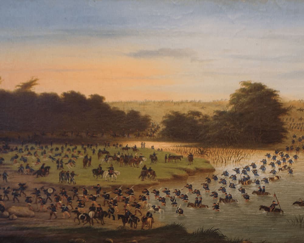
Cándido López paintings: the soldier painter
Cándido López paintings tell a war story most battle art doesn’t. López wasn’t commissioned to observe the fighting from a safe distance, he was in it. He was born in Buenos Aires in 1840. He started out as a self-taught daguerreotypist, working portraits with a business partner before the war. Nothing about that early career suggested he’d end up known as a war painter. Then, in April 1865, he enlisted as a second lieutenant. That was the start of the Paraguayan War , and everything about his work changed from there. Self Portrait, by Cándido López Oil on canvas 1856 He carried drawing materials into the field for the entire time he was fighting. He sketched troop movements and camp scenes between battles. In 1866, during the assault on Curupaytí, a piece of shrapnel took his right hand. Still, he didn’t stop painting. Instead, he retrained his left hand from scratch and kept working. What makes Cándido López paintings distinct isn’t just the story behind them, though. He chose a horizontal format that was unusual for oil painting at the time. It let him hold several simultaneous actions on one canvas: soldiers advancing on one side, smoke and wounded on another, the terrain itself doing as much narrative work as any single figure. Originally, he set out to complete ninety of these war paintings from his field sketches. In the end, he finished a bit more than fifty. Later, he moved into landscapes and still lifes. He signed some of that later work under the pseudonym “Zepol,” his own name spelled backward. I keep coming back to the landscapes especially, since the way he handled a sunset sky, or smoke drifting over a river, is some of his most controlled color work. If you’re ever in Buenos Aires, the paintings are worth seeing in person at the National Museum of Fine Arts (MNBA or Museo Nacional de Bellas Artes) in Recoleta. I’m a member there, and the room with López’s battle scenes is one I still stop in every time I visit.
Read more
Small creative rituals that actually hold up
Small creative rituals work better than dramatic resolutions to “be more creative.” The habits that actually stick tend to be small enough that skipping them once doesn’t derail the whole practice. A five-minute entry point: the smallest creative ritual that works Waiting to feel inspired before starting is a losing strategy. A small, repeatable action, opening the sketchbook, putting on a specific playlist, putting your favorite fragrance on your scent diffuser, works better because it doesn’t depend on motivation showing up first. The ritual creates the mood, not the other way around. Feed the work with things that aren’t the work Reading something unrelated to your field , wandering through a museum you’ve never visited, taking a class in a skill that makes you nervous: none of this looks productive in the moment. Often, it’s where a lot of unexpected material actually comes from. Creative work that only draws from creative sources tends to flatten out over time. Let bad days be part of your small creative rituals Some stretches produce nothing worth keeping. In fact, that’s not a failure of the ritual. It’s the ritual working as intended over a long enough timeline. A practice that only counts the good days isn’t sustainable, because most days aren’t good days. Share the work before it feels finished Talking to other people about work in progress, not just finished pieces, tends to surface ideas that solitary practice doesn’t reach. It’s a small ritual on its own: showing something unresolved to someone else on purpose, on a regular basis, instead of waiting until it’s polished enough to be safe. Generally, the rituals that last aren’t the ones that feel most inspiring on day one. They’re the ones small enough that doing them half-heartedly on a bad week still counts.
Read more
Wasting time boosts creativity: how to use it on purpose
Wasting time boosts creativity more reliably than staring at a blank page ever has for me. It happens almost every time before I start a big project: I lose myself doodling something unrelated, scrolling for reference images I don’t need yet, or just sitting there doing nothing in particular. The deadline is right there, and instead of working toward it directly, I drift. And then, somewhere in the middle of that drifting, the actual idea shows up. A half-formed concept clicks into place, or a solution to a problem I hadn’t consciously been thinking about just appears. The deadline stops feeling like a threat the moment that happens. Why wasting time boosts creativity, and it isn’t just me making excuses There’s a name for this: researchers call it the Creative Procrastination Paradox. Daydreaming, mind-wandering, and plain boredom turn out to be productive states, not wasted ones. When your mind isn’t locked onto a specific task, it makes connections between things that a focused brain would never put together, because focus is, by definition, narrowing. I’m not arguing for abandoning deadlines altogether. There’s a real difference between productive drifting and just avoiding the work entirely, and the line between them is worth being honest with yourself about. What this actually looks like in practice The drifting itself isn’t the useful part. What matters is what you do with it. I keep a sketchbook nearby specifically for the ideas that show up during these unfocused stretches, because if I don’t write them down immediately, they disappear as quickly as they arrived. Half of what ends up in a finished piece started as a note scrawled during a moment I would have called “wasting time” a few years ago. The other thing that changed how I use this is scheduling it on purpose instead of feeling guilty about it. Fifteen or twenty minutes of deliberately doing nothing, no phone, no reference hunting, just sitting with a problem. It produces better results for me than pushing through another hour at the desk when nothing is coming. Why wasting time boosts creativity better than forcing focus Deadlines create urgency, but urgency and creativity don’t actually run on the same fuel. Urgency narrows your options down to the first workable solution. Wandering opens them back up. The trick isn’t choosing one over the other permanently, it’s knowing which state a given problem actually needs, and giving yourself permission to be in the unproductive one when that’s what the problem calls for. That’s the actual mechanism behind why wasting time boosts creativity: it’s not magic, it’s just a different cognitive mode.
Read more
Finding inspiration in the commonplace: what boredom actually gives you
Finding inspiration in the commonplace sounds like good advice until you actually run out of anything else to look at. That happened to me in 2020, during lockdown, when the same window, the same doorway, the same houseplant were the entire visual world for months at a time. Where Spacetime, Parallel Skies, and Confinement pieces actually came from I made a whole series of pieces during that period. This post includes four of them: Spacetime , Parallel Skies , Multiverse and Confinement . In fact, none of them started from a dramatic idea. They started from staring at the same things every day: a doorway, a staircase, a window frame, a balcony, the sky outside and the corner where a plant sat. With nowhere to go, those ordinary thresholds became the thing I actually had to work with. What came out of that constraint was a set of images where windows and doorways stop being architecture and start being portals. A staircase leading into open sky. A window opening onto a sea of clouds. A plant framed against a field of stars instead of a wall. The longing underneath all of it was simple: wanting to walk outside, wanting to be with people again, wanting open space that wasn’t rationed by square meters. Making the work was a way of getting some of that back without actually being able to leave. There was also another window in the room that whole time, the screen. Meetings, meals, everything happened through glass and pixels, and that constant presence left its own mark on the work. Parallel Skies in particular carries traces of it: the color glitches of a video, the scan lines of a lagging stream, the chromatic aberration of a lens pushed past its limit. These experimental flaws were part of what the everyday actually looked like that year, so they became part of the visual language too, less by choice and more by proximity. Why finding inspiration in the commonplace is easier said than done Generally, a doorway you walk through fifty times a day stops registering as an image at all, it becomes pure function. What changed during lockdown wasn’t that the doorway got more interesting. It’s that I ran out of anything else to compare it to, so I actually looked at it for the first time in years. That’s the real mechanism behind finding inspiration in the commonplace: not a switch you flip, but a forced narrowing of attention that makes you notice what was always there. How to try finding inspiration in the commonplace yourself Of course, you don’t need a pandemic to get the same effect, just a deliberate limit no matter were you are. Spend one day only sketching things within arm’s reach of your workplace. Photograph the same corner of your kitchen at three different times of day and notice how the light changes what you’d call “the same” scene. Redraw a doorway or a window in your own home as if it opened onto somewhere else entirely. Go from there to anywhere you can imagine. The constraint does the work that motivation usually can’t. It’s not about training your eye to see beauty everywhere in the abstract. It’s about removing your other options until the ordinary is the only thing left to look at, and then actually looking. Transforming ordinary moments into art Ordinary experiences can be translated into art by shifting your perspective. Even making coffee or watching rain can inspire new work. A cluttered desk or a rainy window reveals unexpected beauty when you look with a creative eye. The constraint does the work that motivation usually can’t. It’s not about training your eye to see beauty everywhere in the abstract. It’s about removing your other options until the ordinary is the only thing left to look at, and then actually looking. Frequently Asked Questions: How can artists stay inspired every day? Build a small, repeatable habit instead of waiting for inspiration to strike: ten minutes a day looking closely at one ordinary object or corner of a room, sketched or photographed. Rotate between quick sketches, a phone photo, and a short written note so the habit doesn’t get stale. What’s a good exercise for breaking out of routine without traveling anywhere? Pick one object you see every day, your keys, a doorway, a window, and redraw it three different ways: exactly as it is, exaggerated, and as if it belonged to a different world entirely. That last version is closer to what actually happened with the Spacetime series: the same window, reimagined as a threshold to somewhere else. Every ordinary space holds more than it shows on a normal day. Come see what I’m looking at right now on Instagram.
Read more
Georgia O’Keeffe: finding beauty in the unassuming
Only through selection, elimination, emphasis, do we arrive at the real meaning of things. Georgia O’Keeffe Georgia O’Keeffe paintings are hard to forget once you’ve really looked at them. She zoomed in close on flowers, bones, and sky until they stopped being recognizable objects and became something else: landscapes of color and texture that feel both microscopic and vast. She was born in Wisconsin in 1887, trained in New York with Arthur Wesley Dow, and eventually ended up in New Mexico, where she spent decades working in near-isolation from the mainstream art world. That distance, physical and professional, is still visible in the work. It doesn’t look like it’s trying to fit into anything. The flowers in Georgia O’Keeffe’s paintings What made O’Keeffe’s flower paintings so immediately striking was scale. She took subjects everyone considered decorative and minor, then filled the entire canvas with them. An iris becomes a topography. A poppy becomes a study in the physics of red. In fact, the abstraction isn’t a distortion of the flower. It’s the result of looking at it with complete attention. There’s also an undeniable sensuality to how she handled form. The curves, the deep shadows inside petals, the way light travels across a surface. She never explained or denied what people read into the work. She let the paintings hold the ambiguity. New Mexico and the bones When O’Keeffe first went to New Mexico in 1929, she was looking for distance from New York and from Stieglitz. What she found instead was a landscape that matched something already in her work: stark, flat-lit, resistant to prettiness. She stayed for the rest of her life. The desert series is where her compositional thinking is most visible. The bleached skulls she collected and painted against vast blue skies have nothing sentimental about them. They’re formal studies in contrast and negative space, and they hold up as well today as anything being made right now. As she described it herself: “The bones cut sharply to the center of something that is keenly alive in the desert.” What Georgia O’Keeffe’s paintings teach about composition This is the part that interests me most as an art director. O’Keeffe’s instinct for cropping was almost photographic, decades before digital tools made that kind of framing easy to manipulate. She understood that showing less of something could make it feel larger, and that the edge of the canvas was a decision as important as anything inside it. The stark contrasts, the bold shapes, the narrow palette forcing the eye through a composition: these are lessons that transfer directly to any visual work. Clarity and restraint tend to produce more impact than complexity. Her paintings are, in fact, some of the clearest proof of that I know. A painter who didn’t need the room’s approval What I find most interesting about O’Keeffe isn’t the flowers or the bones individually. Instead, she built an entire body of work on her own terms, geographically isolated, largely indifferent to critical fashion, and continued developing her vision well into her nineties. That kind of commitment to a singular way of seeing is rarer than talent. The next time you look at one of her Georgia O’Keeffe paintings, skip the biography for a minute. Just look at how the light moves, where the edge falls, what she chose not to show. That’s where the real work is.
Read more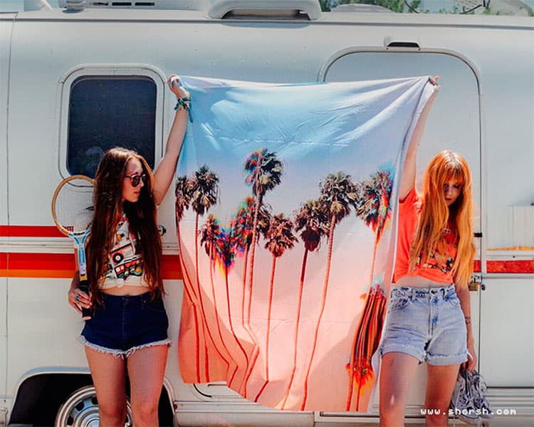
Personalizing your environment with art: five key decisions
Personalizing your environment with art usually gets reduced to matching colors to a couch. In fact, the choices that actually change how a room feels have very little to do with the paint on the walls. Scale is the first decision in personalizing your environment with art A piece that’s technically right for a wall but too small for the room disappears into the background. Most people undersize their art out of caution. Going one size up from what feels safe is usually closer to correct, especially in a room with high ceilings or a lot of open wall space. Pick a focal point, not a backdrop Decide whether a piece needs to anchor the room or blend into it before buying it, not after. A large, high-contrast piece over a sofa reads completely differently than the same piece tucked into a hallway. As a result, that decision changes what else in the room needs to stay quiet for it to work. Your chosen art should reflect your personality and evoke positive emotions . Mix mediums instead of matching them A room full of framed prints in identical frames reads like a hotel lobby. Mixing a print with something textured, a wall tapestry , a small sculpture, a piece with visible brushwork, gives a space more depth than uniformity does. The goal isn’t matching. It’s variation that still feels intentional. Check out these 5 unique ideas to decorate with art and elevate your spaces . Trust the piece that unsettles you slightly Often, the art that grows on someone over years is rarely the piece that felt safest in the store. Something with a little friction, a color combination you wouldn’t have picked yourself, an image that’s slightly strange: these tend to hold up better over time. The piece that matched perfectly on day one often doesn’t. It’s the same quality I wrote about with painting and presence . Work made with real attention tends to carry that attention through, whether it’s the one making it or the one living with it afterward. Budget for one piece when personalizing your environment with art A single piece bought with intention outlasts five bought to fill space. If the budget is tight, waiting for the right piece works better than filling a wall with five that are merely fine. The room ends up looking more considered with fewer, better choices in it.
Read more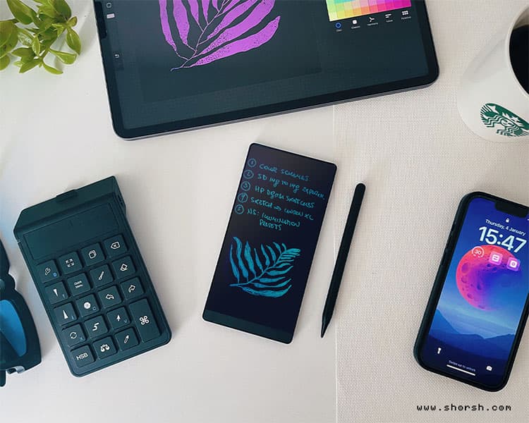
List-making for creativity: turning chaos into direction
List-making for creativity sounds like a contradiction. Creativity is supposed to be loose, associative, resistant to structure. But in practice, the opposite is true: a list is one of the fastest ways to get a chaotic idea out of your head and into a form you can actually work with. I make lists constantly, for almost every part of my process. Not as a productivity system, but as a way to think. What list-making for creativity actually looks like in my process Project ideas go in a running list I add to whenever something occurs to me, usually completely unrelated to whatever I’m working on at the time. I list visual references before I ever open a moodboard tool: artists, films, color combinations, textures, anything that comes to mind when I think about the mood I’m chasing. I turn client feedback into a list immediately after a call, before the nuance of what they actually meant gets lost in my own interpretation of it. Even naming ideas for a project or a series start as a messy list of ten or fifteen options before any of them get refined. None of these lists are neat. Half the items get crossed out. That’s fine. The point isn’t a clean final product, it’s capturing the raw material before it disappears. Why list-making for creativity beats a paragraph A paragraph forces you to commit to a sequence and a relationship between ideas before you’re ready to. A list doesn’t ask for that. Each item can exist on its own, unranked, unconnected to the ones around it, and that’s exactly what a first pass at a creative problem needs. This matters most in the early, messy part of a project, before you know which idea is actually good. Prose invites you to justify an idea as you write it down. A list just lets you record it and move to the next one. That difference sounds small, but it changes how much you’re willing to write down in the first place. Turning a list into direction A list of twenty scattered ideas isn’t useful by itself. The value comes from what happens after: going back through it and noticing which three or four items keep pulling your attention. Those are usually the ones worth pursuing, not because they’re objectively the best, but because something in them is still generating interest after the initial burst of writing them down. I treat my project list this way. Most entries sit there for months, sometimes years, before I come back to one and realize it’s finally the right moment for it. The list isn’t a to-do queue. It’s more like compost: most of it just needs time. The list-making habit that actually matters The specific format doesn’t matter much. Notion, a paper notebook, the notes app on your phone: any of them work as long as you actually use it consistently. What matters is treating the list as something you add to constantly, not something you write once and revisit occasionally. List-making for creativity isn’t about forcing order onto something that resists it. It’s about giving your ideas somewhere to sit until you’re ready to look at them again.
Read more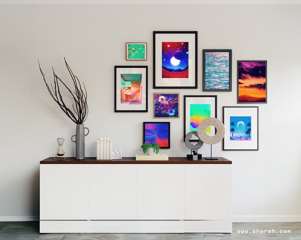
Decorate with art: 5 unique ideas to elevate your spaces
People treat decorating with art like an afterthought, something to pick once the furniture is already in place. Flip that order and the room usually turns out better. Here are five ways to decorate with art that change how a space feels, not just how it looks. Five ideas, one goal: make the room feel considered instead of decorated. Build a gallery wall with a point of view A gallery wall works when the pieces in it don’t all match. Different sizes, different styles, a few frames that clash on purpose. The point isn’t uniformity. It’s a collection that reads as one wall while each piece still tells its own story. Also, rearrange it every so often. People stop noticing a gallery wall that never changes. Decorate with art where it isn’t expected A hallway, a kitchen, the inside of a bookshelf. People notice art in an unexpected spot precisely because it’s unexpected. That element of surprise does more for a room than another framed piece at eye level. It’s what makes it feel like you decorate with art on purpose, not just fill wall space. Generally, small spots work especially well. A narrow hallway or a bookshelf gap has room for exactly one piece, with nothing else competing for attention. Let furniture double as art In fact, furniture can carry the same visual weight as a print on the wall. A table with a printed glass top, or a chair upholstered in something with real character. A shelf built to double as a display case works the same way. Still, none of this needs to be expensive. One piece done well makes the point better than five safe ones. Light changes what a piece does in a room Generally, the same piece under a spotlight reads completely differently than it does under flat overhead light. A wall sconce or a soft string of lights next to a piece shifts the mood of the whole wall. That’s the cheapest way to change how a room feels, cheaper than buying anything new. Even changing the angle of a single light can be enough. Rotate the collection instead of committing to one arrangement forever Nothing on the walls needs to be permanent. Swapping pieces in with the seasons, or just when a room starts to feel stale, keeps things current. It doesn’t require a full redecoration. This is also where the Shop comes in handy. Worldwide shipping means a new piece can be in the room within a couple of weeks. For anyone drawn to bolder, more durable pieces, the Displate collection is worth a look too. Metal prints hold up differently than paper ever will. None of these five ways to decorate with art need to happen all at once. Pick whichever one fits the room that’s bothering you most right now, and let the rest wait.
Read more
What art actually does: five artists, five truths
What art actually does gets lost in most quote roundups. Generally, the quotes get pulled out, printed over a stock photo, and stripped of the specific life that produced them. Each one below comes from an artist doing something concrete with their work, not just feeling inspired by it. Creativity as something you have to unlearn “Creativity is part of human nature. It can only be untaught” . Ai Weiwei Almost nobody is born unable to draw. What actually happens is that at some point, usually around age eight or nine, someone tells a kid their drawing looks wrong, and the kid decides they’re “not good at art,” and stops. Weiwei’s quote isn’t about talent. Instead, it’s about the fact that most adults who say “I can’t draw” aren’t describing a limitation, they’re describing a decision they made decades ago and never revisited. That’s what art actually does at the most basic level: it just needs permission to come back. What art actually does for a mind under pressure “I fight pain, anxiety, and fear every day, and the only method I have found that relieves my illness is to keep creating art” . Yayoi Kusama This isn’t a metaphor for Kusama. She has lived voluntarily in a psychiatric institution in Tokyo since the 1970s, and her studio is across the street from it. The dots and the infinity rooms she’s known for came directly out of hallucinations she couldn’t otherwise control. In fact, for her, making art isn’t a wellness practice. It’s closer to a survival mechanism, a way of putting a frame around something that would otherwise be unmanageable. The honesty of a curated life “Art is the most beautiful of all lies” . Tracey Emin Critics often describe Emin’s work as brutally confessional: an unmade bed, a tent embroidered with the names of everyone she’d slept with. But even the most autobiographical piece is still a selection. Emin chose what to include, what angle to show, what to leave in the frame. The “lie” isn’t dishonesty. It’s the simple fact that any representation, no matter how raw, is still a choice about what gets shown. Making invisible people visible “I was writing my names on walls to say ‘I exist,’ then I started pasting pictures of people with their names to say they exist.” JR (Jean René) JR’s actual practice is photographing people who are usually overlooked, residents of favelas, refugee camps, housing projects, and pasting huge portraits of them in public space. Still, the unifying power of art isn’t abstract in his case. It’s the very concrete act of making someone’s face impossible to ignore in a place where they’d otherwise be invisible. What art actually does when it stops decorating “Art should comfort the disturbed and disturb the comfortable” . Banksy This is the line that matters most for anyone doing commercial or client work. Decoration asks nothing of the viewer. It fills a wall and matches the couch. Art with an actual point of view asks something, even if it’s small: to notice, to reconsider, to feel a little less settled than before. Most working artists live somewhere between those two poles on any given project, and knowing which side you’re leaning toward is worth checking.
Read more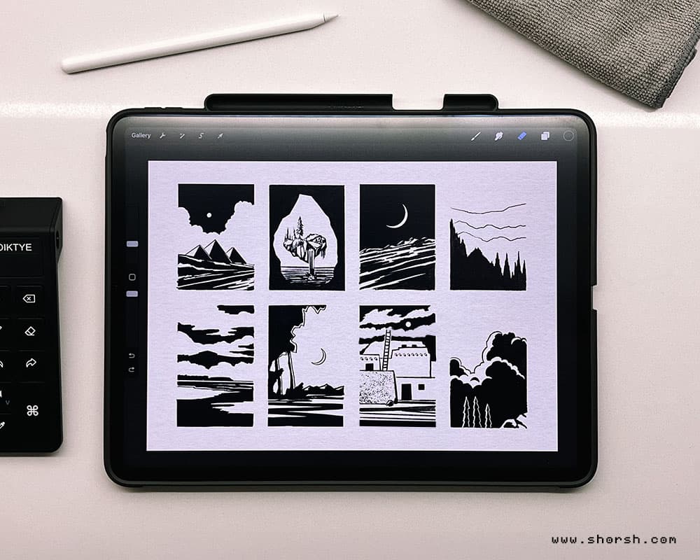
Notan Thumbnail Sketching: Light and Dark
Notan thumbnail sketching is one of the tools I come back to most often before starting a piece. These small, fast studies, done with a pen, pencil, or brush, force a decision that a photograph never asks you to make: what actually matters in this scene, and what can disappear. A photograph records everything indiscriminately. A notan thumbnail demands choice. It’s the artist’s decision-making made visible: taking the overwhelming detail of the real world and reducing it to a handful of shapes in black and white. Why sketch when you could just take a photo Thumbnails force you to decide what’s essential and cut everything else. That elimination is the actual first step of making a piece of art, not a preliminary chore before the real work starts. A photo shows you what’s there. A thumbnail shows you what you noticed. What they’re actually for Notan thumbnails work as memory aids and as planning tools. They capture the initial spark of interest in a scene, the reason it caught your eye in the first place, before that reason fades. They’re useful in museums too, as a way of studying a painting’s structure quickly. And because the first composition is rarely the best one, thumbnails let you test several options before committing to any of them. How to make a notan thumbnail sketch Start with whatever caught your attention: a word or two describing the feeling is often enough to hold onto. Draw a rough rectangle, block in the major shapes, and ignore details entirely. Squint at the reference until only the big shapes remain visible. Then commit: block the darkest areas in black, leave the lightest areas white, and let the sketch evolve as you refine it. The goal isn’t accuracy. It’s capturing the relationships between shapes, the contrast, the mood, whatever made the scene worth noticing in the first place: fog around trees, the angle of light across a mountain, a specific kind of quiet. Why the extra step is worth it Skipping straight to a finished piece feels faster, but thumbnails save time overall. They let you solve composition problems while the cost of a mistake is still a thirty-second sketch, not hours of work. Every stroke in the final piece benefits from decisions already made at the thumbnail stage. And there’s something else: once the foundation is solid, you paint with more trust and a lot more joy. You’re not improvising the structure anymore. You’re just enjoying the process. The idea behind notan thumbnail sketching Notan comes from a Japanese design concept centered on the placement of light and dark values next to each other, translating three-dimensional form into a flat, two-dimensional pattern. Traditionally, artists worked this out in paint, ink, or cut paper, but the same logic applies directly to digital image-making. The principle hasn’t changed, only the tools have. Making notan sketches digitally You can build effective notan studies in Photoshop or Procreate. Start with a reference photo and convert it to grayscale. For a true two-value notan, use Threshold (Image > Adjustments > Threshold) and adjust the cutoff until the black and white shapes read clearly. Or, for a three-value version with a mid-tone gray, use Posterize. Adjusting curves beforehand lets you push the contrast around before committing to the cutoff. The digital version turns notan into something you can iterate on in seconds rather than minutes. I still start most of my own projects with notan thumbnail sketching this way. A five-minute study has saved me from more bad compositions than I can count, and it costs almost nothing to discard if it doesn’t work.
Read more
Shorsh Skies Collection: a surreal vision from heaven
In fact, the Shorsh Skies Collection started on a beach in 2016, not in a studio. I was watching the sunset and thought about blending different moments of sky into a single image. Almost like an overexposed photograph, pushed further into something stranger. Eventually, that idea turned into years of experimenting with photograph manipulation , working from skies I’d photographed in different places. The Shorsh Skies Collection is over 50 pieces now, and I’m still adding to it. How the Shorsh Skies pieces come together Each piece blends sky photos from different locations and times into the same frame. That’s done with multi-exposure techniques, then refined further in post-production. Still, the clouds end up in patterns that couldn’t exist in a real sky. Colors shift somewhere between memory and invention. That’s really what the whole series is chasing. A feeling closer to a half-remembered place than an actual photograph of one. An NFT exhibition that no longer exists online Back in 2021, during the NFT boom of the pandemic, I minted a set of Shorsh Skies pieces on MakersPlace. MakersPlace was an online gallery built specifically for NFT art. Meanwhile, MakersPlace featured the collection in their “A Year of Looking” exhibit. I also sold pieces from the wider Shorsh Skies work on SuperRare and TOKEN Editions, where sales did happen. None of the 29 pieces minted specifically on MakersPlace ever sold, though. That’s just how it went for that particular platform. MakersPlace itself doesn’t exist anymore. The platform shut down, the site is gone, and there’s no way to browse that exhibit today. So that part of the collection’s history only lives here now, in this record of it having happened. Where Shorsh Skies stands now Then the crypto winter of 2022 changed how people talked about NFTs. Market saturation, speculation, and real fraud cases made a lot of that early enthusiasm look naive in hindsight. I still think proof of ownership is a real idea, even if most of the hype wasn’t. Better regulation could still make tokenized ownership something worth trusting again, maybe. You can see the rest of what’s still up, prints and the NFT pieces, in the shop .
Read more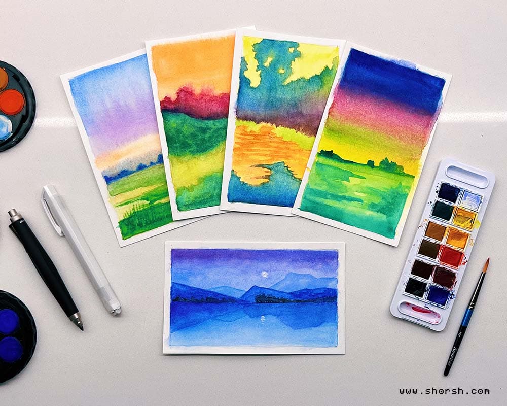
Sketchbook tips for artists: 8 ways to use it better
Generally, the sketchbook tips for artists that actually stick tend to be the ones that change how you think about the object itself. Most people treat their sketchbook like a portfolio in progress: every page has to justify itself, every drawing has to earn its place. That’s, in fact, the fastest way to stop using it. I’ve kept sketchbooks for years. They’re where my actual thinking happens, not in the finished work. Here’s what I’ve learned. Treat your sketchbook like a lab, not a gallery The single most important shift is permission. Permission to draw badly, to test something that won’t work, to write a note next to a sketch that says “this is wrong but I don’t know why yet.” A sketchbook that only contains your best work isn’t doing its job. The mess is the point. Experiment with materials you don’t normally use If you always work digitally, pick up a pen and ink. If you paint, try dry media. The unfamiliarity slows you down in a useful way: you can’t rely on muscle memory, so you start actually looking at what you’re doing. Different tools also produce marks you can’t replicate any other way, and sometimes those accidents become the most interesting things in the book. Work in themes: one of the best sketchbook tips for artists Picking a constraint, a subject, a palette, a format, and committing to it for two weeks or a month is one of the better sketchbook tips for artists I’ve come across. Still, it forces you to solve the same problem repeatedly. Portraits for a month. Urban sketching for a month. Hands. In any case, the repetition teaches you things that variety doesn’t. Do quick sketches without finishing them Not every drawing needs to be resolved. Some of the fastest pages in my sketchbook are just five minutes of gesture, a rough note about proportion, or an idea that never goes further than a scribble. That’s fine. The point of a quick sketch isn’t to finish, it’s to catch something before it disappears, whether that’s a pose, a mood, or a stray idea for a piece I might return to months later. Set a specific goal for your sketchbook practice “Draw more” doesn’t work as a goal. “Fill one page before bed” does. The smaller and more specific the commitment, the more likely you are to do it regularly. These are the sketchbook tips for artists that tend to have the most impact over time: the small, daily ones. Five minutes every day adds up faster than three hours once a month, and the habit itself starts to matter as much as what you produce. Date every entry Even so, this is a small habit with a surprisingly large payoff. When you go back through old sketchbooks and can track when something was drawn, you get an honest picture of your own development. You also start to notice patterns: when you were working under pressure, when you were experimenting, when you were just going through the motions. That information is genuinely useful. Look at other artists and let it feed your sketchbook Not copy, respond. Find something that interests you, whether it’s a composition, a technique, or a way of handling light, and try to do something with that influence in your own pages. Keep a section for references, clippings, things that caught your eye. Eventually, that section becomes a record of what you were looking at, and that turns out to be as interesting as the drawings themselves. Let it get weird The pages nobody will ever see are where the most interesting things happen. Abstract marks, combinations that shouldn’t work, ideas that feel embarrassing to put down: those are usually the ones worth following. That, more than anything, is what makes sketchbook practice useful for artists: it stays yours.
Read more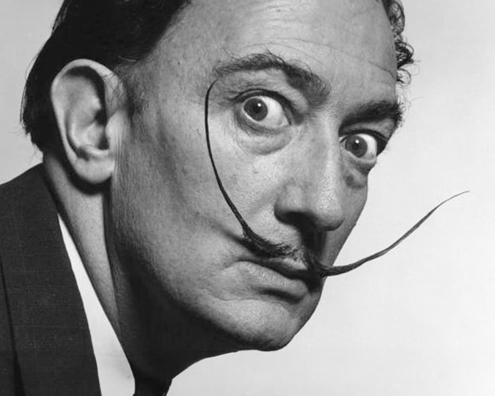
Salvador Dalí surrealism: precision applied to the impossible
Salvador Dalí surrealism is, in many ways, the version of surrealism most people picture when they hear the word. The melting clocks. The vast, bleached landscapes. Figures that are human-shaped but wrong in some way you can’t locate. Born in Catalonia in 1904, Dalí came to define a movement that was already underway, then pushed it somewhere no one else had thought to go. I’ve been drawn to his work since I was a student, and the pull hasn’t diminished. There’s something in the way he combines technical precision with complete logical impossibility that still strikes me as one of the hardest things to pull off in visual art. “The Great Masturbator”, painted in 1929, is where many of those obsessions first appear in concentrated form. The central image is based on a rock formation at Cap de Creus on the Catalan coast, which Dalí read as a face with its nose pressed to the ground. From that starting point the painting accumulates: ants, a grasshopper, a lion’s head, a female figure emerging from the profile, a bleeding knee. The elements don’t form a narrative so much as a personal inventory of fears and desires rendered with the same clinical precision he would use for everything else. It’s autobiographical in a way that most painting isn’t, not because it tells a story but because it shows the inside of a specific mind at a specific moment. Not irrational: what Salvador Dalí surrealism actually was Generally, the common reading of Salvador Dalí surrealism is that it’s irrational, dreamlike, subconscious. Dalí himself would have rejected that. His method, which he called the paranoiac-critical method, was about inducing a controlled hallucinatory state while maintaining the technical discipline to render it with photographic accuracy. The images aren’t vague or impressionistic. They’re impossibly precise. In fact, the soft watches draped over a branch and a sleeping figure in a desert landscape in “The Persistence of Memory” (1931) are rendered with the care of a Dutch Old Master. Every surface has texture. Every shadow falls correctly. The strangeness lives entirely in the logic of the objects, not in the execution. That combination, technical perfection holding an impossible idea, is what makes the painting so hard to dismiss. Dream Caused by the Flight of a Bee “Dream Caused by the Flight of a Bee Around a Pomegranate a Second Before Awakening” (1944) is one of the most cinematically constructed images in his catalog. A sleeping figure floats above a flat rock over the sea. From a pomegranate hovering in the air, a fish emerges, then a tiger leaping from the mouth of another tiger, then a rifle with a bayonet aimed at the sleeper’s arm. The entire chain is connected by the logic of a single bee sting about to happen. Indeed, what Dalí understood about dreams is that they have internal causality. They don’t just produce random images. They build sequences with their own compressed logic, and this painting is structured exactly the way a real dream is structured. Often, surrealist paintings feel like dreams from the outside. This one feels like being inside one. The eccentric persona as artistic strategy Dalí’s public persona, the flamboyant mustache, the theatrical pronouncements, the calculated outrage, was not separate from his art. It was an extension of it. He understood, decades before personal branding became a concept, that the artist’s image shapes how the work is received. By making himself into a spectacle, he guaranteed that his paintings would always be approached through a charged frame of reference. His output was also genuinely multidisciplinary. Beyond the paintings, he eventually designed jewelry , collaborated with filmmakers, produced theater sets, and wrote. The work wasn’t confined to canvas. That restlessness is something I recognize and respect. The Reminiscence and the range of Dalí’s surrealism “Reminiscence of Millet’s Angelus” (1934) shows two monumental figures looming over a flat landscape, cast from the same composition as Millet’s famous painting. Dalí obsessively reinterpreted Millet’s Angelus across his career, seeing in it a latent violence he wanted to make visible. The figures in his version have a weight and stillness that reads as threatening rather than devotional. His relationship to art history was always active, not reverential. Instead, he borrowed from the masters to destabilize them, not to pay homage. That approach, using shared visual memory as raw material for displacement, connects directly to what I wrote about in the René Magritte surrealism post. The two artists were working the same territory from completely different directions. Why Salvador Dalí surrealism still holds up Precision doesn’t age. The technique is impeccable, the questions are unresolved, and the images are still doing something to viewers that most paintings don’t. What is the relationship between a dream image and a waking one? How much does the mind impose its own logic onto what it perceives? Dalí’s paintings don’t answer those questions. They make you feel them, which is a different and harder thing. His influence on what came after, including on my own surreal visions as an artist, isn’t about the melting clocks as a motif. It’s about the permission his work grants: to be technically rigorous and completely strange at the same time. The creative thinking books that shaped my practice kept returning to Dalí precisely for that reason.
Read more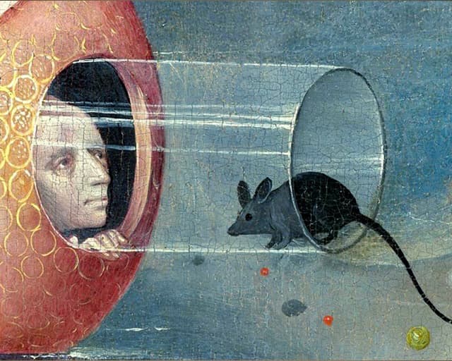
Hieronymus Bosch paintings: seven curiosities
Hieronymus Bosch paintings have captivated me for a long time. It’s as if he dipped his brush into a cauldron of dreams and nightmares, then rendered every detail with the patience of a much calmer painter. Hieronymus Bosch paintings look like nothing else being made in Europe at the time, and five centuries later they still don’t look like anything else. He painted before anyone had a word for surrealism Bosch was born around 1450 in ‘s-Hertogenbosch, in the Duchy of Brabant, now the southern Netherlands, and worked through a period thick with religious anxiety and folk superstition. In fact, nothing in that context explains what he actually painted. His work looks like a direct transmission from somewhere else entirely, four hundred years before Dalí or Magritte gave that impulse a name. Hieronymus Bosch paintings: the Garden of Earthly Delights “The Garden of Earthly Delights” (c. 1490 to 1510) is the clearest case. The left panel shows Eden, the right shows Hell, and the center panel, the one everyone remembers, is packed with nude figures, oversized fruit, and structures that look grown rather than built. It isn’t one scene. It’s an argument about paradise, temptation, and punishment laid out across three panels, dense enough that art historians are still arguing over what half of it means. His creatures never repeat In “The Temptation of Saint Anthony,” Bosch subjects the saint to a parade of tormentors: hybrid animals, half-human figures, things with no clear taxonomy at all. What’s notable is that across his whole surviving output, the inventions almost never repeat. Most artists working with invented creatures fall back on a small set of motifs. Instead, Bosch seems to have generated an entirely new vocabulary of monsters for every commission. The everyday symbols hidden in Hieronymus Bosch paintings masterpieces: “The Haywain Triptych” (c. 1510-1516) uses something deceptively ordinary, a cart loaded with hay, as its central image. In the period, hay symbolized worthless material goods that people fought over anyway. Bosch builds an entire moral scene around a wagon nobody would look at twice. That’s exactly the kind of symbolic sleight of hand that runs through his whole body of work: the meaning hides inside the mundane, not the monstrous. His judgment scenes are more disturbing than his monsters “The Last Judgement” (c. 1482) puts the grotesque creatures to work in service of something bleaker than fantasy. The panel stages the separation of the saved from the damned, and Bosch’s punishments for the damned are inventive in a way that’s genuinely upsetting rather than merely strange. It’s the clearest evidence that Bosch’s imagination wasn’t decorative. Rather, it was doing theological work. Five centuries of arguing hasn’t settled anything “The Ship of Fools” (c. 1490-1500) shows a boatload of clergy and commoners drinking and carousing while adrift, presumably headed nowhere useful. Historians still debate what exactly Bosch was satirizing, the clergy, human folly in general, or something more specific to Brabant in his lifetime. That the debate hasn’t resolved after five hundred years says something about how deliberately layered his symbolism actually was. Why Hieronymus Bosch paintings still work today What holds up across all five of these paintings isn’t the shock value of the creatures. It’s that Bosch built worlds complete enough to survive without their original context. You don’t need to know fifteenth-century Dutch moralizing to feel unsettled standing in front of “The Garden of Earthly Delights.” The strangeness does its own work, the same way it did in 1500.
Read more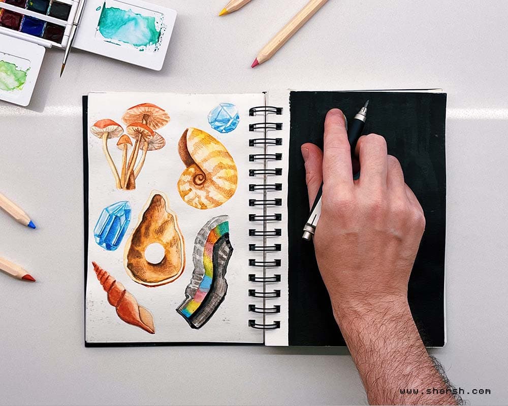
Drawing to think: the hands that shape ideas
“To draw is to sharpen an idea, drawing is the precision of thought” Henri Matisse I think about that Matisse line often, mostly because it’s true in a way that’s easy to forget. Drawing isn’t just sketching lines and shapes. Still, it’s a way into clarity that thinking alone doesn’t get you to. Here’s what happens when you draw to think, and how to use that connection between hand and mind on purpose. Drawing to think starts with hand and mind working together When pencil meets paper, or stylus meets tablet, both the physical and the cognitive sides engage at once. Drawing something accurately forces real observation, the kind that notices details and nuances most people scroll straight past. Eventually, that habit of close looking carries over. It makes for more careful thinking in general, not just at the drawing table. Every drawing is also a string of small decisions about proportion, perspective, and composition. That’s really just problem-solving in disguise. Also, considering different angles on paper is good practice for considering different angles on a problem later. Turning abstract ideas into something you can see In fact, drawing is also the bridge between an idea in your head and something you can point at. It gives shape to whatever was abstract a moment ago. That makes it a lot easier to work with. That’s usually the moment an unconventional idea stops sounding far-fetched and starts looking like something that could genuinely work. The flow state drawing gets you into Drawing regularly tends to pull you into a state where time stops mattering. The mind stays fully on the task, nowhere else. That state does more than sharpen the work. It also puts you back in touch with your own thoughts and feelings. It’s the same mindful state I try to protect from screens the rest of the day. Drawing as its own language Drawing works as a form of communication too, a way to say something that’s genuinely hard to put into words. Generally, translating a thought or a feeling into something visual makes the expression feel more honest, less filtered. Matisse’s point holds for anyone, not just artists. Drawing sharpens thinking no matter who’s holding the pencil. How to build a drawing-to-think habit Keep a sketchbook nearby , always, so you can capture an idea the moment it shows up. It doesn’t need to be anything special. A plain notebook works, and so does the back of whatever’s already lying around. Draw without expecting it to look good. Treat the page like nobody’s watching, because usually nobody is. Quality matters less than quantity at the start. Sketch constantly and let the pencil move before the doubt catches up. With enough practice, drawing to think stops being a tool you reach for occasionally and turns into how you think.
Read more
Reference and texture photography: how I use my phone
I use my phone a lot, but not the way most photography tips assume. In fact, most of my shots exist to become something else later. A piece of a matte painting, a texture, a detail borrowed into a fantasy scene that doesn’t exist anywhere real. Here’s how reference and texture photography fits into my process. Reference shots for scenes I want to remember When I’m somewhere with details worth keeping, I take the shot on the spot. A texture on a wall, an unusual angle of light, the shape of a doorway, whatever catches my eye. Still, none of it is precious on its own. The value shows up later, when a fragment of that photo ends up buried in a matte painting or concept art piece. For mood reference specifically, I’ll sometimes run a shot through VSCO first. It’s a quick way to see how a color grade might read before committing to anything in the piece itself. Reference and texture photography need different conditions A scene shot and a texture shot want almost opposite conditions. For a scene, mood matters, so dramatic light is often the whole point. For a texture, dramatic light is the enemy. It creates shadows and hotspots that stay in the file permanently. Generally, I shoot for textures under flat, even light. Overcast days work well, so does open shade, anything that keeps the surface readable without one dominant shadow direction. Everything needs to be in focus too, as sharp as the phone camera allows. Blur is impossible to fix once you’ve tiled the texture. Turning the photo into something tileable Once I have the shot, the real work starts back at the computer. I clean it up, fix the contrast, and crop and blend the edges. That continues until the seams disappear and the whole thing repeats without a visible break. From there, I’ll often run it through software to generate the other maps a real material needs. Height, roughness, bump, sometimes a UV pass too. None of that works if the original photo has a strong light source burned into it. It also doesn’t work if any part of the frame is out of focus. Overall, that’s why the shooting conditions matter more for reference and texture photography than for almost anything else I do. A quick checklist for reference and texture photography Even light, nothing directional, overcast or open shade works best. Everything in focus, edge to edge, with no motion blur. Shoot flat-on whenever the surface allows it, since a straight angle makes it much easier to correct perspective later. And take more shots than feel necessary. One clean frame beats five that almost worked. Why bother with any of this Ultimately, none of this is about reference and texture photography as a technically perfect exercise for its own sake. It’s raw material for a world that doesn’t exist yet. The photo is only useful once it disappears into something else. A texture, a matte painting, a corner of a scene nobody will ever recognize as a real place. If you’re building out your own texture library, I keep a running list of free 3D texture sources . I go back to those when my own photos aren’t enough.
Read more
AI as a tool for artists: what I’ve changed my mind about
I wrote the original version of this post a while ago. Back then, I didn’t have a clear picture of what AI was going to do to this industry, or to others. My thinking has changed a lot since, so this is a full rebuild, not a touch-up. Five things stand out to me now, and I want to walk through each one honestly. There’s no ethical way to use AI as a tool for artists right now As of right now, there’s no fully ethical way to use AI as a tool for artists. Every major model learned, at least partly, from material nobody cleared the rights to. In fact, that’s not a minor technicality. It’s the foundation the whole technology sits on. No amount of careful prompting or thoughtful use erases where the training data came from. The law is already behind, and it’s not catching up soon Regulation always trails technology. That’s not new. But with AI specifically, the gap already feels too wide to close in time to matter. A real legal framework covering training data, copyright, and attribution is still years away, if it comes at all. By the time it exists, the current generation of models will already be the foundation everything else builds on. Waiting for the legal picture to clear up before deciding how to relate to this feels like waiting too long. AI as a tool for artists: why it’s worth learning fast Even with all of that unresolved, learning AI as a tool for artists is still worth doing. The professional landscape around it is changing faster than almost anything else I’ve watched in this industry. Artists and other professionals with a strong 2D or 3D background can do something genuinely new here. Once AI enters their process as a tool, not a replacement, the work gets more impressive, not more generic. The same shift is already visible in medicine and in tech. In both fields, it’s the specialists with deep domain knowledge getting the most out of these tools, not beginners. If you’re an artist, even trying AI as a tool for artists on admin work is worth it. It frees up time for the part that’s genuinely fun, making the work itself. That’s how I started using them myself, and it’s still mostly where I keep them. These days I’ll also use AI to generate some assets. But I keep the parts I enjoy most for myself. That’s modeling, building out scenes, rendering them, then painting over the result by hand. The process is sacred, not something to optimize away Specifically in art, I think the process itself is sacred. It shouldn’t answer to the logic of time and money that runs the rest of the market. That’s not a small opinion to hold as someone who works commercially, but I still believe it. To stay in touch with that part of the process, I’ve been making more time for it. Lately, that’s meant more time with traditional painting and drawing, away from the screen. Still, there’s something about working without a screen that keeps the human, unmediated part of making art alive. Also, it’s the part of the work I need to protect from getting scheduled, optimized, or delegated away. I wrote about this at length in a post on flow state in painting . That side of making art feels especially necessary to hold onto today. Start with friction, and always supervise The place to start is with the mechanical tasks that generate the most friction. Those are the repetitive, tedious parts of a workflow nobody enjoys anyway. From there, always supervise the output, correct it, adjust it. Treat it as a draft from an assistant, never as a finished decision. That’s the whole point of freeing up mechanical time in the first place. It leaves more of it for thinking and executing with the kind of creativity that’s still specifically human . AI as a tool for artists, not a replacement for the process I use AI to build reference material and to learn faster, never to hand over the whole process. Handing over the whole process is where things go wrong, and it usually produces something flat and generic. Nothing about that kind of output gets sharper or more interesting. It just gets faster to produce. That’s the real line for me: AI as a tool for artists who still do the thinking and executing, not a replacement. I don’t know exactly where this goes next, and I stopped pretending I do. But I’d rather learn the tool on my own terms now than be forced to catch up later, from behind.
Read more
Books for creative block: five that actually help when you’re stuck
Books for creative block are easy to find and mostly useless. Most just repackage “believe in yourself” into 200 pages. These five books for creative block are the exceptions, the ones that gave me something to actually do instead of something to feel. The Creative Cure, by Jacob Nordby This one deals directly with creative paralysis rather than talking around it. Nordby treats the block as something with identifiable causes, not a mysterious curse, and the exercises are specific enough to actually try instead of just nodding along with. Thinking, Fast and Slow, by Daniel Kahneman Not a creativity book at all, but it explains why blocks happen better than most books that claim to be about creativity. A lot of creative paralysis comes down to specific cognitive biases: overvaluing the first idea, catastrophizing a bad draft, anchoring too hard on what “should” work. Understanding the mechanism makes it easier to catch in the moment. The Practice of Groundness, by Brad Stulberg Blocks are often just racing thoughts and scattered attention wearing a creative disguise. Stulberg’s approach to mental clarity isn’t creativity-specific, but the techniques translate directly. Calming the noise first tends to matter more than any creative exercise applied on top of it. Your Inner Critic Is a Big Jerk, by Danielle Krysa Most blocks are really the inner critic getting louder than the actual work. Krysa’s book is specifically useful because it treats self-doubt as a manageable, almost comic character instead of an unbeatable force. That makes it easier to work around instead of freezing in front of it. Caffeine for the Creative Mind, by Stefan Mumaw and Wendy Lee Oldfield When the problem isn’t the mindset but literally not knowing where to start, this book is pure mechanism. Prompts and quick exercises meant to get a pencil moving in the next five minutes. Useful specifically for the days when analysis isn’t what’s needed, just momentum. These five books for creative block solve different versions of the same problem. Nordby and Krysa work on the emotional block. Kahneman and Stulberg work on the mental one. Mumaw and Oldfield just get you moving when neither of the others quite applies.
Read more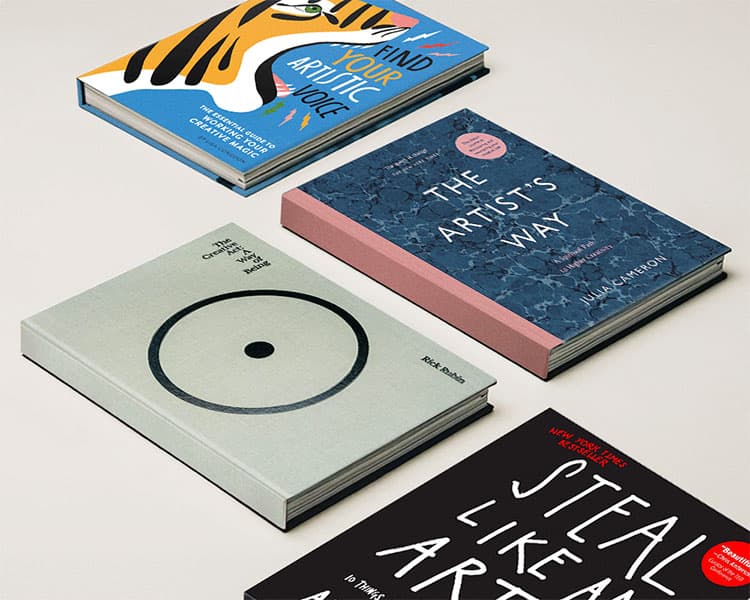
Books on the creative process: five for the long game
Books on the creative process tend to fall into two categories: the ones that motivate for a week, and the ones that actually change how you think about the work. Generally, these five belong to the second category. I’ve reread parts of each one more than once, which is the real test. The Creative Act: A Way of Being, by Rick Rubin This is the book on the creative process I recommend first. Rubin brings decades as a music producer to a book that isn’t really about music at all. It’s closer to a set of principles for paying attention, treating every decision in the process as worth noticing rather than rushing past. Dense in places, but the kind of density that rewards rereading a section months apart. Find Your Artistic Voice, by Lisa Congdon In fact, Congdon’s core argument is that you don’t discover voice in a single moment, you accumulate it through repetition and honest mistakes. That idea alone reshaped how I think about my own process , specifically the chapters on filtering influence instead of avoiding it entirely. Steal Like an Artist, by Austin Kleon Kleon’s central claim, that originality is really just well-digested influence, is uncomfortable the first time you read it and obviously true the second. Still, the book is short enough to reread in an afternoon, and it holds up better on a second pass than most books twice its length. The Artist’s Way, by Julia Cameron Some of Cameron’s language reads dated now. But the underlying structure, specifically the practice of daily pages, is one of the few habits from any creativity book I’ve actually kept doing for years. The exercises work less as inspiration and more as maintenance. Big Magic, by Elizabeth Gilbert Gilbert’s argument about fear coexisting with creative work rather than blocking it is more useful than most advice about “overcoming” fear entirely. The book treats fear as a permanent passenger, not an obstacle to defeat once and move past. None of these five books on the creative process are quick fixes, which is exactly why they’ve lasted on my shelf longer than the books that promised faster results.
Read more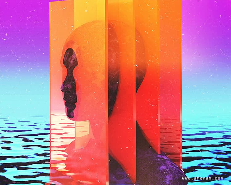
How to overcome creative block: 10 tips that actually work
How to overcome creative block is something every artist figures out on their own, usually in the middle of a project they care about. You sit down to work, open your file, and nothing comes. The cursor blinks. The canvas stays white. I’ve been there more times than I care to count. These are the strategies that have actually helped me get moving again. Go somewhere new when creative block hits Staying at your desk and pushing harder rarely works. Your environment shapes your mental state more than you’d expect. Go to a museum, a park, a bookstore in a neighborhood you don’t usually visit. You’re not hunting for inspiration in some grand sense, just novelty. A different set of visual inputs is often enough to break the loop. Stop and actually rest Creative blocks are often just depletion. Resting is not the same as procrastinating. Take a day away from making things, and do something that has nothing to do with your field. Spend time with people who don’t care about your work. The pressure to always be producing is one of the main reasons blocks happen. Sometimes the only real solution is to stop fighting them. Get outside feedback When you’ve been staring at your own work for too long, you lose the ability to see it clearly. Reaching out to a peer or a mentor can shift things fast. What you need is a different pair of eyes, not reassurance. Hearing someone else describe what they see in your unfinished piece often shows you the next step. Use a constraint to break out of the block One of the most effective things I do when I’m stuck is give myself an arbitrary rule. Work only in two colors, or finish something in under 30 minutes. The goal is not to produce something great. It’s to make the task feel small and specific instead of open and infinite, so your inner critic has less to work with. Make something bad to break the creative block Perfectionism is usually the real block. The fear of making something bad keeps you from making anything at all. So make something bad deliberately. Sketch something ugly, paint over a finished piece, write the worst possible version of whatever you’re avoiding. Getting your hands moving again matters more than the quality of what you produce while doing it. Change your workspace This one is simple and it works. Move to a different room, work outside, rearrange your desk. The physical space you associate with being stuck can keep you stuck. A fresh location often resets things faster than any technique will. Sit with the discomfort before reaching for a solution Before jumping into a creative exercise or reaching for your phone, try sitting quietly for a few minutes and doing nothing. Not formal meditation, just noticing what’s actually happening. Sometimes the block is anxiety about a specific project. Sometimes it’s fatigue, or something that has nothing to do with work at all. Identifying the actual cause tends to be more useful than working around it. Learn something outside your usual field This is one I come back to often. Trying a different software, a physical technique you’ve never used, or something with no obvious connection to your work tends to produce the most interesting cross-contamination. The ideas you bring back from unfamiliar territory are often the ones your audience hasn’t seen, because they came from somewhere your audience hasn’t been looking. Inject randomness into the process Open a random color palette generator and work with whatever it gives you. Pick a random word and make a piece that responds to it somehow. Alternatively, flip your reference image upside down and work from that. The point is to interrupt the habits that are keeping you in one mode. Once you break the pattern, the block usually loses its grip. Celebrate finishing, not just succeeding Finishing a sketch you’re not proud of is still finishing. Creative momentum comes from small completions, not from occasional big wins. Every time you close a file and have something to show for the session, however rough, you’re reinforcing the habit of making. That habit matters a lot when the next block arrives. Blocks are part of the work. I’ve never met an artist who doesn’t get stuck. The difference, in my experience, is having enough options that you know what to try next the next time creative block hits instead of just waiting it out.
Read more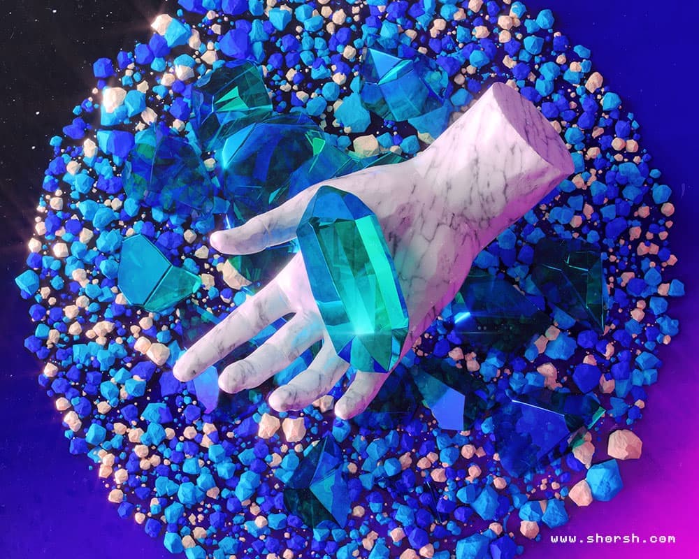
Choosing a color palette for mood in artwork
A color palette for mood in artwork isn’t something I treat as decoration. It’s one of the first decisions I make on any piece, often before the composition itself is fully resolved. Color carries emotional information faster than any other element in an image, and getting it wrong undermines everything else in the piece. Warm colors: choosing a palette for tension Warm colors, reds, oranges, yellows, read as energy, urgency, heat. They push forward in a composition and demand attention before anything else in the frame. “Secrecy,” a piece I made in 2022, relies almost entirely on red. The color isn’t there to decorate the image. In fact, it’s doing the emotional work of the piece: the tension in that painting comes directly from how saturated and dominant the red is across the frame. Take the red out and the piece stops working, even if every other element stays exactly the same. Cool colors and calm Cool colors, blues, greens, purples, read as calm, distance, and quiet. They recede in a composition rather than push forward, which makes them useful when the goal is stillness rather than urgency. “Porcelain Landscape,” from 2021, relies almost entirely on blue. Still, the dominant tone gives the piece its sense of tranquility, and it’s a good example of how a single dominant hue can carry an entire mood without needing supporting elements to reinforce it. Color harmony and the wheel Choosing warm or cool is only the first decision. Generally, the second is how the colors relate to each other, which is where the color wheel becomes useful. Analogous schemes, colors sitting next to each other on the wheel, produce a sense of unity and coherence. They’re the safer choice when you want an image to feel cohesive rather than dramatic. Complementary schemes, colors sitting opposite each other on the wheel, do the opposite. They create tension and contrast, and they’re useful when you want a specific element to stand out rather than blend into the rest of the composition. Cultural context matters too Color associations aren’t universal. Red reads as luck or love in some cultures and as danger or warning in others. If a piece is going to be seen by an international audience, and most commercial illustration work is, it’s worth checking whether the palette carries a meaning you didn’t intend. Choosing a color palette on purpose The palette isn’t a finishing touch you add once the composition is done. It’s an essential part of the emotional architecture of the piece from the start, the same way a director chooses lighting before shooting a scene. Once color becomes a deliberate decision instead of an afterthought, it’s hard to look at other people’s work the same way again. That’s the difference a deliberate color palette for mood in artwork actually makes.
Read more