Choosing a color palette to set the desired mood in your artwork.
Let’s dive into the fascinating world of color psychology! Learn how to choose the perfect color palette for your artwork to evoke the desired emotions. Harness the power of color to create art that speaks to the soul.
share this!
Are you curious about how colors can affect the way we feel?. Today, we’ll take a journey into color psychology to discover how different shades are capable of creating strong emotional connections and how this knowledge can help us to pick the perfect color palette to set the mood of certain pieces of art.
When combining colors, the first and most essential thing that we could do is considering the emotions we want to convey. Warm colors such as red, orange, and yellow often evoke feelings of energy, passion, and warmth. These hues are ideal for creating images that exude excitement or intensity.

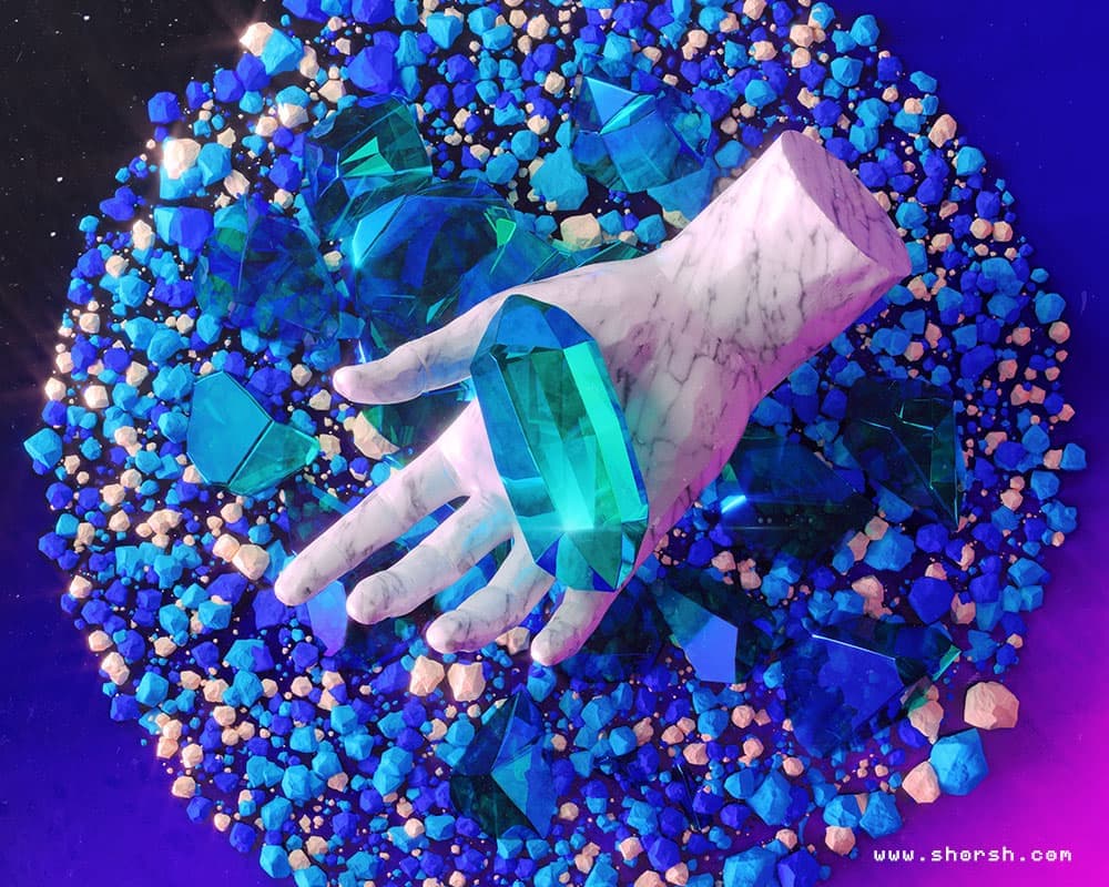
On the other hand, cool colors like blue, green, and purple tend to evoke calmness, serenity, and tranquility. They work well in images that aim to convey a sense of peace or relaxation.

The harmony between colors is equally important in setting the mood of an illustration.

Analogous color schemes use neighboring hues on the color wheel to create a harmonious effect. This can be specially useful to convey a sense of unity or coherence within your artwork.
Complementary color schemes involve using colors that are opposite each other on the color wheel. These relations create contrast and can be effective in giving a sense of tension or highlighting specific elements within your illustration.
Different colors also have different cultural associations as well. For example, red may symbolize luck or love in some cultures while representing danger or warning in others. Consider these cultural nuances when choosing your palette to ensure that your illustration’s message resonates with its intended audience.
By strategically selecting a color palette that resonates with the desired mood and message of your illustrations, you can effectively engage viewers on an emotional level and amplify the impact of your work.
Rounding up:
Color is a powerful tool that can serve as an effective vehicle to you emphasize the message behind a visual piece. Think about the emotions you desire to evoke and choose a color palette that matches them. With some practice, you’ll master the art of combining colors to create images that will captivate your audience by telling a compelling story right from the very first glance.