
Reference and texture photography: how I use my phone

Most of my phone shots aren’t meant to be seen as photos. They’re raw material, headed for a matte painting or a seamless texture.
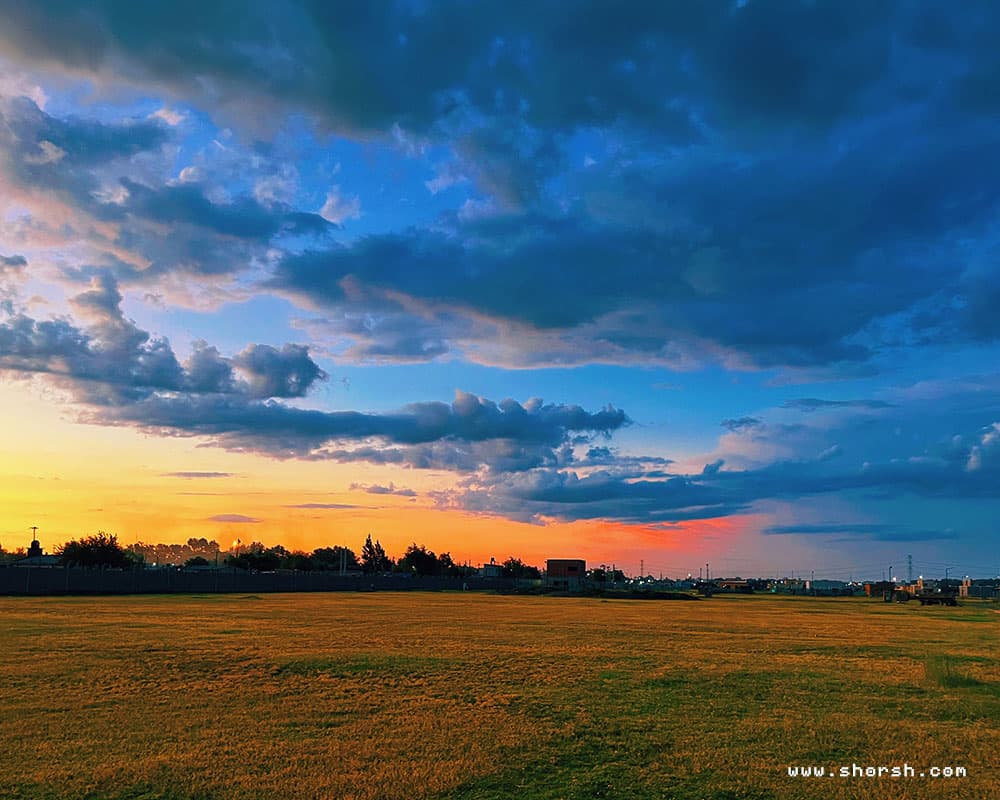
I use my phone a lot, but not the way most photography tips assume. In fact, most of my shots exist to become something else later. A piece of a matte painting, a texture, a detail borrowed into a fantasy scene that doesn’t exist anywhere real. Here’s how reference and texture photography fits into my process.
Reference shots for scenes I want to remember
When I’m somewhere with details worth keeping, I take the shot on the spot. A texture on a wall, an unusual angle of light, the shape of a doorway, whatever catches my eye. Still, none of it is precious on its own. The value shows up later, when a fragment of that photo ends up buried in a matte painting or concept art piece. For mood reference specifically, I’ll sometimes run a shot through VSCO first. It’s a quick way to see how a color grade might read before committing to anything in the piece itself.
Reference and texture photography need different conditions
A scene shot and a texture shot want almost opposite conditions. For a scene, mood matters, so dramatic light is often the whole point. For a texture, dramatic light is the enemy. It creates shadows and hotspots that stay in the file permanently. Generally, I shoot for textures under flat, even light. Overcast days work well, so does open shade, anything that keeps the surface readable without one dominant shadow direction. Everything needs to be in focus too, as sharp as the phone camera allows. Blur is impossible to fix once you’ve tiled the texture.
Turning the photo into something tileable
Once I have the shot, the real work starts back at the computer. I clean it up, fix the contrast, and crop and blend the edges. That continues until the seams disappear and the whole thing repeats without a visible break. From there, I’ll often run it through software to generate the other maps a real material needs. Height, roughness, bump, sometimes a UV pass too. None of that works if the original photo has a strong light source burned into it. It also doesn’t work if any part of the frame is out of focus. Overall, that’s why the shooting conditions matter more for reference and texture photography than for almost anything else I do.
A quick checklist for reference and texture photography
Even light, nothing directional, overcast or open shade works best. Everything in focus, edge to edge, with no motion blur. Shoot flat-on whenever the surface allows it, since a straight angle makes it much easier to correct perspective later. And take more shots than feel necessary. One clean frame beats five that almost worked.
Why bother with any of this
Ultimately, none of this is about reference and texture photography as a technically perfect exercise for its own sake. It’s raw material for a world that doesn’t exist yet. The photo is only useful once it disappears into something else. A texture, a matte painting, a corner of a scene nobody will ever recognize as a real place. If you’re building out your own texture library, I keep a running list of free 3D texture sources. I go back to those when my own photos aren’t enough.