
Landscape illustration styles: five ways to build a mood

From Turner’s dissolving atmospheres to Eyvind Earle’s geometric precision, landscape illustration covers more ground than most people realize. Here’s a breakdown of the five main styles.
Landscape illustration styles cover an enormous range, from paintings that read almost like photographs to compositions reduced to two or three shapes and a horizon line. Understanding that range matters whether you’re building a visual vocabulary for your own work or trying to figure out which references actually serve a specific project.
These are the five styles I come back to most often, with the artists and works that define each one most clearly.
Realistic and romantic landscape
Realism in landscape illustration doesn’t just mean accuracy. It means using light, atmosphere, and detail to make a place feel inhabited and felt, not merely documented. Caspar David Friedrich is the clearest example: his figures standing before vast landscapes aren’t describing nature, they’re measuring the human scale against it. The emotional weight comes from that contrast.

J.M.W. Turner pushed realism toward something closer to pure atmosphere. His late paintings dissolve landscape into light and weather to the point where the subject almost disappears. What survives is the feeling of a place rather than its topography. That approach, sacrificing legibility for mood, is one of the most direct influences on how contemporary digital artists handle environmental lighting.

Impressionist landscape illustration styles
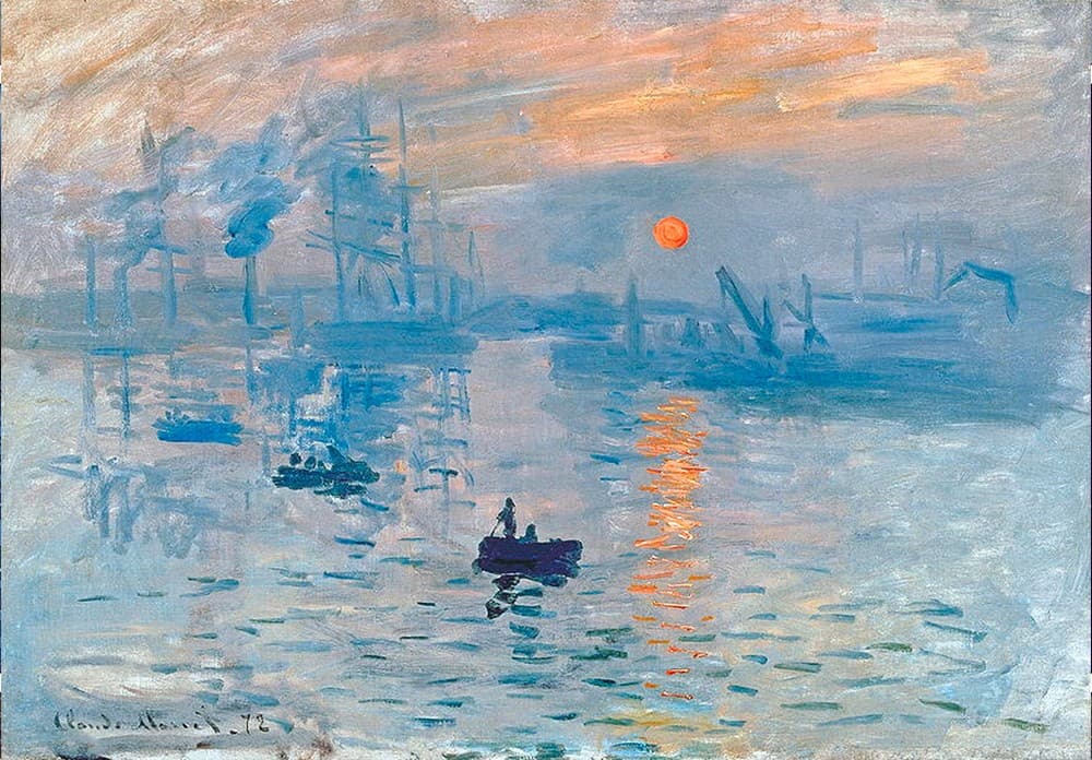
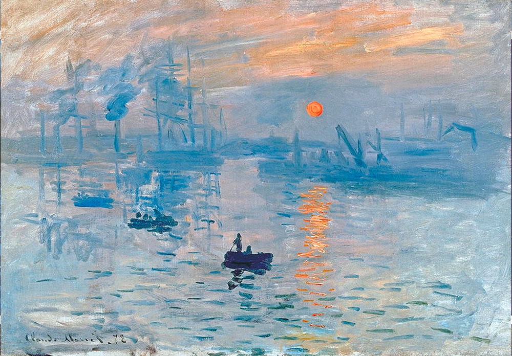
Impressionism broke the contract between painting and documentation. Instead of recording what a landscape looks like, impressionist painters recorded what it feels like to perceive it. The shimmer of light on water, the blur of trees in wind, color that shifts depending on the hour. Monet’s series paintings, the haystacks, the Rouen Cathedral, the water lilies, are studies in how the same subject changes completely under different conditions.
For illustrators, impressionism is useful as a lesson in economy. The paintings work because of what’s left out. A few confident marks in the right place carry more visual information than a fully rendered surface, and that principle transfers directly to digital work.
Abstract landscape illustration
Abstract landscape illustration keeps the spatial logic of a landscape, a ground plane, a horizon, a sense of depth, while releasing any obligation to represent recognizable forms. Mark Rothko’s color field paintings are the extreme end of this: pure fields of color that produce an almost physical sensation of atmosphere and scale.
What makes abstraction useful as a reference for commercial work isn’t the absence of representation but the clarity of composition. Abstract landscapes force you to solve the problem of space and mood without the shortcut of recognizable objects. Working from that constraint occasionally produces solutions that carry over into more representational work.

Stylized and graphic landscape
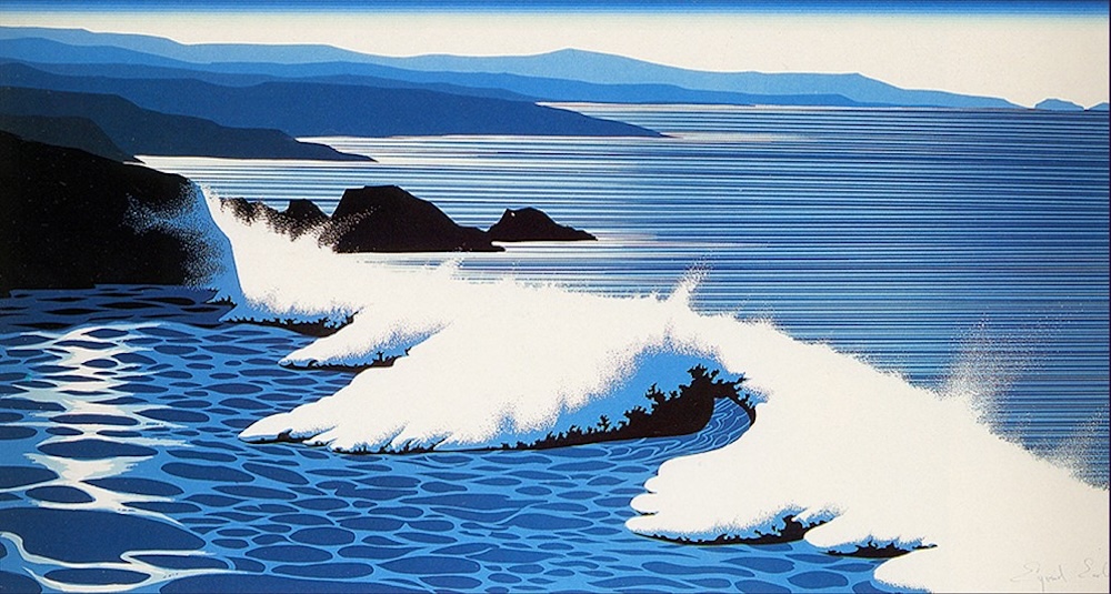
This is the landscape illustration style I find myself returning to most in my own work. Eyvind Earle, who created the visual language of Sleeping Beauty for Disney in 1959, developed a style that flattened natural forms into precise geometric shapes while keeping the color and mood of a real landscape. It feels both designed and alive.
The stylized approach is particularly well-suited to work that needs to carry strong visual identity: album covers, editorial illustration, key art for entertainment. The graphic simplification makes the image readable at any scale, and the deliberate choice of a visual language gives the work a signature that purely realistic illustration often doesn’t have.
Minimalist landscape illustration
Minimalism in landscape illustration reduces the image to its essential elements: a horizon, a color field, sometimes a single form. Contemporary illustrators working in this direction often owe as much to graphic design as to painting. The challenge is that minimalism has no place to hide. Every decision is visible, and a weak composition can’t be rescued by detail.
When it works, minimalist landscape illustration produces images with immediate visual impact and a quietness that other landscape illustration styles can’t replicate. It’s also the style that ages best, because it isn’t built on the visual conventions of any particular moment.