Art showcase
Album cover illustration: how I turn music into visual art
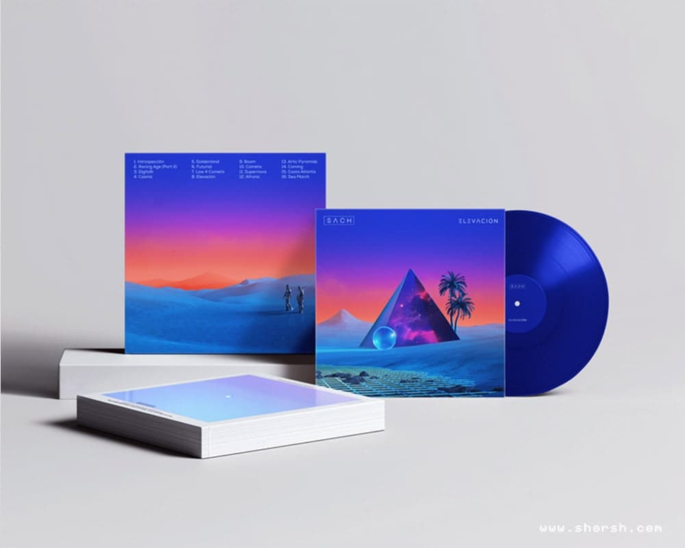
Album cover illustration always starts the same way for me: I put the music on and I don’t touch anything else for a while. I listen on repeat, sometimes for hours, letting the melodies, the lyrics, and whatever mood is underneath all of it settle before I pick up a pencil. The image has to come from the sound, not from a brief. My starting point has always been pencil or pen on paper. There’s something about capturing ideas as they come, without the friction of a screen between the thought and the mark. The final artwork is always fully digital, but those analog sketches are where the real decisions happen. How my album cover illustration process has changed My workflow has evolved considerably over the years. With tighter timelines and new tools appearing constantly, I’ve moved toward a more hybrid approach. Lately that means blending AI-generated fragments with my own sketches and photographs. The AI outputs are never final pieces. They’re starting points that I reshape and pull through my own visual language until they stop looking like anyone else’s work. From there I move into Cinema 4D or Blender, Photoshop, and sometimes After Effects, especially when the project involves animation, to build out the concept. I’m always watching how image-making technologies evolve, because the tools that best support the work tend to change faster than most people expect. That said, I’m not chasing every new release. I stick with the ones that actually serve what I’m trying to make, and add something new only when it genuinely changes what’s possible. The Forester project: building a visual identity from scratch One of the most memorable album cover illustration projects in my career was with the electronic music duo Forester . Their first covers set the visual tone for their entire brand, and the challenge was capturing more than four different releases in single images that still felt like they belonged together. When I was starting out, some artists also asked if I could animate their cover artworks for Spotify Clips or Instagram Reels. At the time I hadn’t considered animation seriously, but their requests pushed me to experiment. I explored ways to bring static artworks into motion, adapting them to different aspect ratios and formats. Eventually, that work led me into animation and video projects I wouldn’t have found on my own. Collaboration opens doors you weren’t looking for, and sometimes those turn out to be the most useful ones. When vision and client expectations don’t immediately align Every project has friction. One of the consistent challenges I’ve faced is balancing my artistic vision with client expectations . After years of experience, I’ve learned that communication does more work than talent in those moments. My focus is always to meet, and ideally exceed, what the client came looking for. At the same time, the work has to stay mine. It’s my artistic voice and my creative decisions that brought these clients to me in the first place. Through my career I’ve worked with clients who trusted that, and in doing so taught me new ways of thinking about images. When both sides hold their ground and still find a way through, the result tends to be something neither would have arrived at separately. Why imperfection makes album cover art stronger In a field where digital tools can produce technically flawless work, there’s real value in leaving rough edges. A hand-drawn line that survived the digital process, a texture that doesn’t quite resolve: these are often the things people remember. They signal that a person made choices, that the work wasn’t assembled from presets. Those imperfections also tend to be what makes a cover feel like it belongs to the artist it represents, rather than to a genre or a moment. The rough edges are usually the most specific thing in the image, and specificity is what lasts. See the work If you’d like to explore more, my cover art gallery has the full collection of album artworks from over the years. You can also follow the Spotify playlist with album cover illustration by Shorsh featuring the music behind the covers. And if you’re working on something that needs a visual voice, reach out .
Read morePersonalizing your environment with art: five key decisions
Personalizing your environment with art usually gets reduced to matching colors to a couch. In fact, the choices that actually change how a room feels have very little to do with the paint on the walls. Scale is the first decision in personalizing your environment with art A piece that’s technically right for a wall but too small for the room disappears into the background. Most people undersize their art out of caution. Going one size up from what feels safe is usually closer to correct, especially in a room with high ceilings or a lot of open wall space. Pick a focal point, not a backdrop Decide whether a piece needs to anchor the room or blend into it before buying it, not after. A large, high-contrast piece over a sofa reads completely differently than the same piece tucked into a hallway. As a result, that decision changes what else in the room needs to stay quiet for it to work. Your chosen art should reflect your personality and evoke positive emotions . Mix mediums instead of matching them A room full of framed prints in identical frames reads like a hotel lobby. Mixing a print with something textured, a wall tapestry , a small sculpture, a piece with visible brushwork, gives a space more depth than uniformity does. The goal isn’t matching. It’s variation that still feels intentional. Check out these 5 unique ideas to decorate with art and elevate your spaces . Trust the piece that unsettles you slightly Often, the art that grows on someone over years is rarely the piece that felt safest in the store. Something with a little friction, a color combination you wouldn’t have picked yourself, an image that’s slightly strange: these tend to hold up better over time. The piece that matched perfectly on day one often doesn’t. It’s the same quality I wrote about with painting and presence . Work made with real attention tends to carry that attention through, whether it’s the one making it or the one living with it afterward. Budget for one piece when personalizing your environment with art A single piece bought with intention outlasts five bought to fill space. If the budget is tight, waiting for the right piece works better than filling a wall with five that are merely fine. The room ends up looking more considered with fewer, better choices in it.
Read moreDecorate with art: 5 unique ideas to elevate your spaces
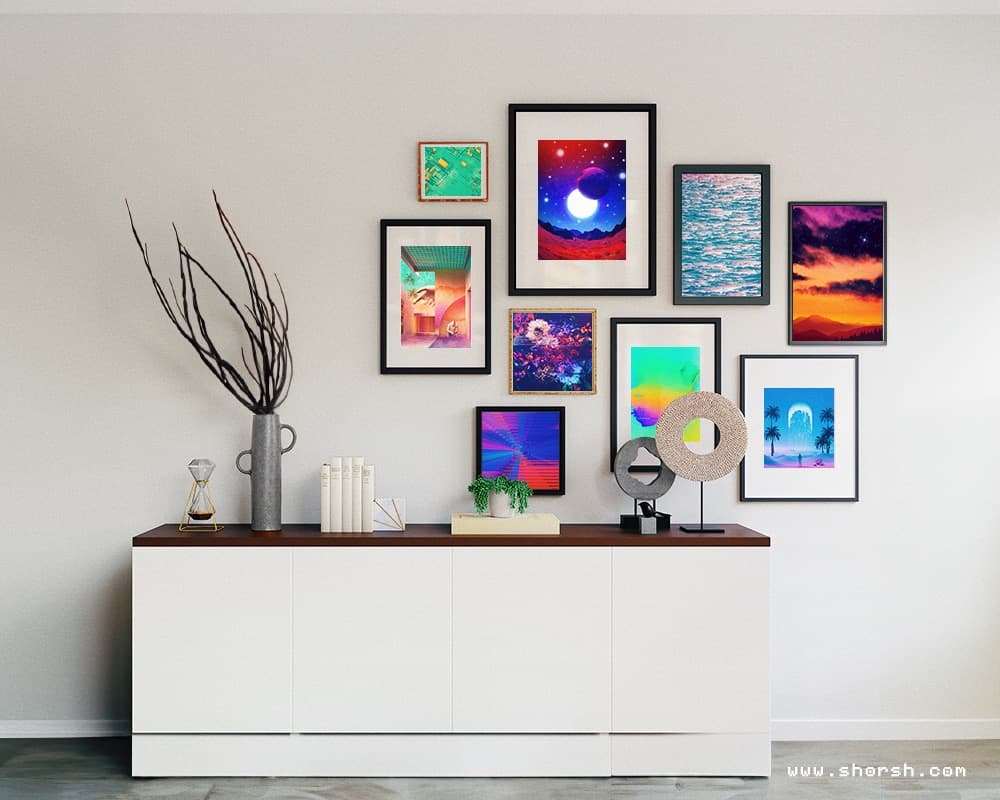
People treat decorating with art like an afterthought, something to pick once the furniture is already in place. Flip that order and the room usually turns out better. Here are five ways to decorate with art that change how a space feels, not just how it looks. Five ideas, one goal: make the room feel considered instead of decorated. Build a gallery wall with a point of view A gallery wall works when the pieces in it don’t all match. Different sizes, different styles, a few frames that clash on purpose. The point isn’t uniformity. It’s a collection that reads as one wall while each piece still tells its own story. Also, rearrange it every so often. People stop noticing a gallery wall that never changes. Decorate with art where it isn’t expected A hallway, a kitchen, the inside of a bookshelf. People notice art in an unexpected spot precisely because it’s unexpected. That element of surprise does more for a room than another framed piece at eye level. It’s what makes it feel like you decorate with art on purpose, not just fill wall space. Generally, small spots work especially well. A narrow hallway or a bookshelf gap has room for exactly one piece, with nothing else competing for attention. Let furniture double as art In fact, furniture can carry the same visual weight as a print on the wall. A table with a printed glass top, or a chair upholstered in something with real character. A shelf built to double as a display case works the same way. Still, none of this needs to be expensive. One piece done well makes the point better than five safe ones. Light changes what a piece does in a room Generally, the same piece under a spotlight reads completely differently than it does under flat overhead light. A wall sconce or a soft string of lights next to a piece shifts the mood of the whole wall. That’s the cheapest way to change how a room feels, cheaper than buying anything new. Even changing the angle of a single light can be enough. Rotate the collection instead of committing to one arrangement forever Nothing on the walls needs to be permanent. Swapping pieces in with the seasons, or just when a room starts to feel stale, keeps things current. It doesn’t require a full redecoration. This is also where the Shop comes in handy. Worldwide shipping means a new piece can be in the room within a couple of weeks. For anyone drawn to bolder, more durable pieces, the Displate collection is worth a look too. Metal prints hold up differently than paper ever will. None of these five ways to decorate with art need to happen all at once. Pick whichever one fits the room that’s bothering you most right now, and let the rest wait.
Read moreShorsh Skies Collection: a surreal vision from heaven
In fact, the Shorsh Skies Collection started on a beach in 2016, not in a studio. I was watching the sunset and thought about blending different moments of sky into a single image. Almost like an overexposed photograph, pushed further into something stranger. Eventually, that idea turned into years of experimenting with photograph manipulation , working from skies I’d photographed in different places. The Shorsh Skies Collection is over 50 pieces now, and I’m still adding to it. How the Shorsh Skies pieces come together Each piece blends sky photos from different locations and times into the same frame. That’s done with multi-exposure techniques, then refined further in post-production. Still, the clouds end up in patterns that couldn’t exist in a real sky. Colors shift somewhere between memory and invention. That’s really what the whole series is chasing. A feeling closer to a half-remembered place than an actual photograph of one. An NFT exhibition that no longer exists online Back in 2021, during the NFT boom of the pandemic, I minted a set of Shorsh Skies pieces on MakersPlace. MakersPlace was an online gallery built specifically for NFT art. Meanwhile, MakersPlace featured the collection in their “A Year of Looking” exhibit. I also sold pieces from the wider Shorsh Skies work on SuperRare and TOKEN Editions, where sales did happen. None of the 29 pieces minted specifically on MakersPlace ever sold, though. That’s just how it went for that particular platform. MakersPlace itself doesn’t exist anymore. The platform shut down, the site is gone, and there’s no way to browse that exhibit today. So that part of the collection’s history only lives here now, in this record of it having happened. Where Shorsh Skies stands now Then the crypto winter of 2022 changed how people talked about NFTs. Market saturation, speculation, and real fraud cases made a lot of that early enthusiasm look naive in hindsight. I still think proof of ownership is a real idea, even if most of the hype wasn’t. Better regulation could still make tokenized ownership something worth trusting again, maybe. You can see the rest of what’s still up, prints and the NFT pieces, in the shop .
Read more